Monthly Archives: May 2014

Feedback on Assignment 5

Overall Comments
Firstly well done on completing the course Joanna, and you have sent a well – ordered set of works this time.  You have taken on board my comments and have made an effort to work outside of your comfort zone, which is just beginning to have an impact and I hope that you will take this forwards on your artistic journey.
You have good basic drawing skills but have struggled to loosen up throughout the course, this is confidence and also understanding the subject of drawing per se, and so you have much more research to do in this area. The power and language of the mark needs to be understood at a deeper level and I hope that you will feel encouraged to pursue this further.
I re-iterate from previous feedback: Re-working is part of artistic practice and you shouldn’t feel discouraged, you have a lot to offer but need to make this push forwards. Have confidence and explore the subject matter to it’s fullest. The handbook is only the starting point. 

Aim to make more than one version of something, this will help you to extend your possibilities. Please don’t write across the top of your images, comment on the back of them only.

Feedback on assignment
There are some very well observed  (though small, which is fine) studies and some variable outcomes, but you you have tried to extend your mediums and ideas – this is enabling you to become more fluent in your decision making process, but there is work to do- which is natural at this stage. 

  • Think about what the immediacy of the mark can bring to a drawing
  • Think about how the act of observing is translated into the mark and how we can affect this through time, physicality, situation and so on.
  • Try to contextualize the work that you are making through close examination of the work of other artists, write about this experience in your learning log.

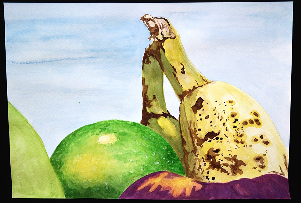
The artichoke drawings
On first impression they feel restrained – but when I lay the studies side by side across the floor I can begin to unpack them intellectually in a different way. So, it is apparent to me that you have tried hard to test out techniques, you have tried to push yourself further and take on board previous comments.
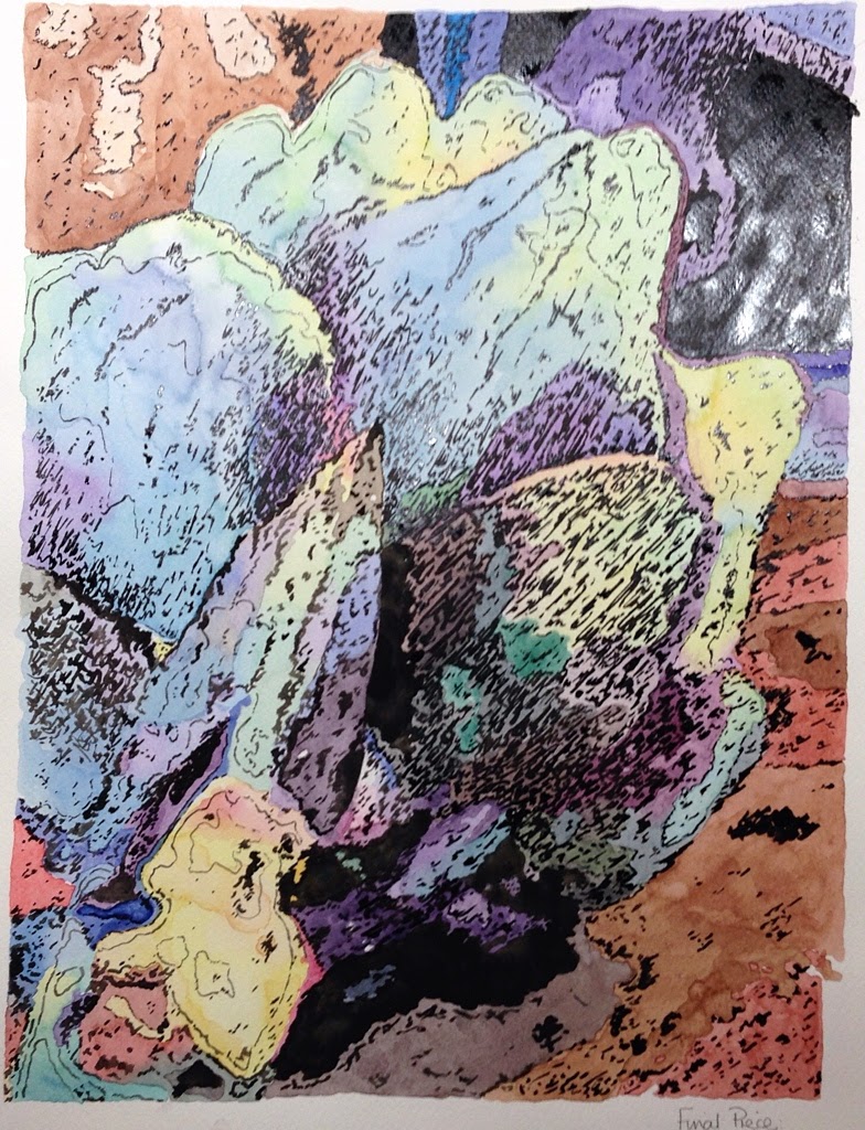
The colour palette is ‘high’ almost technicolour in places but as an exploration I can see why you have chosen to do this. The form of the artichoke is so particular and the view that you have chosen to work from becomes almost abstracted as you work through the various techniques and methods that you are applying.
I know that you have suggested one piece as the ‘finished’ piece for assessment, but when they  are seen together (see below) and then placed in a four they feel stronger, more deliberate and livelier. This highlights to me that you now need to consider how you would show the work at assessment, it is critical that you think about this and in the ensuing time prepare for the event.
My advice would be to show these as a four making decisions as to the way up, order and so on, and then, now that you are so familiar with the form (and if you can) push yourself to make a monochrome ‘four’.  This would really propel you forwards, allowing you to investigate the subject matter showing your knowledge of it through your work. In the second four allow the form to become even more abstracted- see what happens to it- you have begun to push at these possibilities, so let yourself go there fully. Remember that you must indicate how you wish the work to be viewed (in this scenario) to the assessors.

pastedGraphic.png

The intention of the work (above) is to stay with a fixed view so that this familiarization with the form allows you to develop techniques and methods to describe/articulate it to the outside world.  As a single work we lose the intention of the process and so the potential strength – in this situation- so it becomes far stronger if we embrace all and are more inclusive in the final delivery. 

When making a second four, ask yourself some practical questions- what would happen if I blocked in this portion in black ink- what would happen if I transposed the negative and positive spaces? And so on… to see what you can achieve. You could make four black ink tonal drawings aiming towards an abstracted form as one idea amongst many.  In this way you would have two works for assessment each made up of four exploratory images. 

In essence, from what you have already achieved you can now forge ahead and prepare for the assessment, think carefully about my comments and how you can go forwards with them in mind.

  • Think about the intention of the work, what you are trying to do- set out to keep this firmly in mind and making so that the works are as resolved as they might me.
  • Think about how drawings are shown, their size, format, number in relation to each other, a single, a pair, a triptych and so on.
  • Research what a series of drawings might be in terms of contemporary art practice, include this research in your learning log.

Sketchbooks Demonstration of technical and Visual Skills, Demonstration of Creativity
I have seen sample pages from your sketchbooks on your blogsite, but please make sure that your sketchbooks are easily (physically) accessible for the OCA assessors. The blog doesn’t take the place of the actual sketchbooks.

Learning Logs/Critical essays
Your reflective writing is clear but a bit perfunctory; I have endeavored to point towards other artists and would like to see your writing reflect the fact that you have been researching them. In Assignment 3 feedback I gave you some guidelines to help you write about what you are seeing, so perhaps review your tutor reports and look at the suggested artists- also the course book for the research points… it feels like I am missing a whole section on your blog for the research? 

I re-iterate: In your first assignment I wrote: In order to reflect on your own work, it is necessary to reflect on the work of other artists contemporary and historical. You would really benefit from viewing the works of other artists Write about what you are seeing and interpreting, When you can see that an artists’ work represents what you are experiencing in your making, write about why that is happening, what has the artist done and how have they done it, how can it inform your own study?
Get into greater depths begin using a critical language. 

The OCA website has good information on the learning log and its benefits.

  • Try to contextualize the work that you are making through close examination of the work of other artists, write about this experience in your learning log. (I re-iterate)

Suggested reading/viewing

Please revisit the tutor reports for this course and reflect on the suggestied artists and think about their relevance for your work- make notes from your further research.

Please borrow from a library The Primacy of Drawing by  Deanne Petherbridge. 

If you can obtain this book, try to read it. Berger, J (1972) Ways of Seeing, Penguin Berger, it unpacks what it is to look and perceive. I re-iterate try looking on-line in places such as the Tate archive to see more drawing or for contemporary work: http://www.drawingroom.org.uk/ and also http://www.axisweb.org

www.balticmill.com/links for contemporary works. 

Pointers for the assessment
At the present time, you are very light on research for this course. Please ensure that you complete all the research points and consider all the suggested further research of past reports and indicate where and how you have considered them.

Apply the comments from this feedback and previous reports and re-work any suggestions.

Read the selection criteria in your course handbook carefully and edit the work carefully. Label and mark all the work on the back, any comments can also be made on the back.

Please note that I will be unavailable to feedback after the 21st March – 16th April- so please keep to your deadline.


Feedback on Assignment 4

Overall Comments There has been a marked/some improvement since the  last assignment.  You have taken on board my comments about seeing the work in the flesh, and you sent in a good spread of examples from previous assignments- so thank you. It is clear from viewing the works that you have a good basic drawing ability, but you are relying on this rather than pushing the scope of the work (and by extension yourself).  I re-iterate from the last feedback: I strongly advise you to work in more depth both on your drawing practice and on your contextual research. Re-working is part of artistic practice and you shouldn’t feel discouraged, you have a lot to offer but need to make this push forwards. Have confidence and explore the subject matter to it’s fullest. The handbook is only the starting point. 

This is a difficult assignment and you have made an honest approach to it. Well done.

IMG_1682

Reworking on Assignment 4
After reading my tutor comments I went back and looked at all of the work I had done on this assignment with a more critical eye.  I had produced a lot of these drawings during  life drawing classes where time was limited as was the pose.  I went back to the sketchbook and looked at muscle and body formation too.  I also looked at different artists and how they treat(ed) the human form.  I am more a fan of modern art so only skimmed the surface of classic artists such as Michelangelo and Leonardo da Vinci.  I really enjoy the work of artists such as Edward Hopper, Chuck Close and David Hockney.
I chose to rework this piece using the same form and position and still using a graphic illustration style.  Having drawn so many real life sketches I was motivated to change style and try something less realistic.  I am drawn to graphic design and stylised drawings far more than traditional drawing which loses my attention fairly quickly.   I tried to stay true to the form of the person and give tone by shading with light pink watercolour.   After that I wanted to portray a graphic effect with detailed pen work and bright block colour.  I understand the tutor comment about lack of tone in this assignment but I also lack confidence in my ability to render a hyper realistic portrait.  Throughout all the assignments on this course I have constantly looked at the work of many artists but have not necessarily written about each artist.

 Feedback on assignment

The work is not clearly labeled- so I will respond as a broader overview rather than specifics: The approach to the figure feels more honest and straightforward than some of your previous exercises, with less of a propensity to feel the need to ‘make a picture’ rather than interrogating the subject at hand. There are obvious problems across the board but that is normal for this level at this stage. The figure is hard to capture, as you have encountered, and needs much practice. A life class would be great for you – I suspect you are already attending- to give you the needed time to practice in. 

The figure is a complete entity and needs to be treated holistically in terms of drawing. Each situation, each pose is unique to that individual, and as an artist we must find ways to articulate and communicate this to the viewer of the work.  This is considered to be a form of reconciliation between knowledge (I know she has two arms and legs) and observation (she is relaxing her left shoulder, so it appears -to me- lower than her right).

Within the pieces that you submitted, I can see that at times, the figure is ‘fitted’ to the drawing space of the page: the reclining man for example. So, there appears to be some problems of scale, balance and proportion. None of this is unsolvable, just practice needed. To help you, I would suggest that you think about how the muscles and tendons inform the position of the figure, ask yourself ‘how’ the body is working at that moment in that pose. This will help you to think about the distribution of weight: we are all affected by gravity and if we think about the body in a holistic manner (as mentioned above), we will note that each small shift has a cause and effect on another body part. For instance: if I raise my fingers it causes other muscles to contract, and that may alter my weight distribution. You can achieve this within your drawing by using a mark across the surface, in order to instate how skin or indeed clothing is laid over muscle and tendon. This will give shape to the clothing, so that the form is seen within it and shape to the skin (unclothed) through tonality. Using tone to model the figure can be achieved through contour lines, cross hatching/bracelet shading. Lok at Michaelangelo’s sketches to see exemplary use of both, And perhaps look at Tracey Emin’s figure drawings to encounter a wholly different attitude to the figure. 

In figure drawing, it is useful to situate the body in a situation, which you have attempted to do, but this needs considerable attention and consideration.

I was pleased to see you use charcoal on some of the figure drawings and these felt more sensitive- free and as if you enjoyed the exercise. They certainly looked more fulsome and therefore more resolved than the other pieces, it would be advisable to pursue this way of working more thoroughly, with many more variations.

Tonally the work (as whole) is weak, I would advise you to re-visit the tone exercises to refresh yourself. The figure needs thorough use of tone to be able to describe the form well. Perhaps this is why the charcoal worked more in your favour. 

There is a simple line drawing of a girl sitting on the stairs that is very appealing and stood out for me. It is clear that you need to really look at contemporary drawing practice and see how and where you can learn from those producing. In terms of historical research you also need to delve deeper to seek resonance with your practice. 

Learning Logs/Critical essays
I re-iterate from the last assignment:
Your learning log is clearly written in terms of your reflective writing, although it is rather perfunctory, by now I would expect that you have researched further into contemporary artists that have some resonance with your own work and that you had begun to articulate the correlations that you are finding.

In your first assignment I wrote: In order to reflect on your own work, it is necessary to reflect on the work of other artists contemporary and historical. You would really benefit from viewing the works of other artists Write about what you are seeing and interpreting, When you can see that an artists’ work represents what you are experiencing in your making, write about why that is happening, what has the artist done and how have they done it, how can it inform your own study? Get into greater depths using a critical language.

The OCA website has good information on the learning log and its benefits.

Suggested reading/viewing
If you can obtain this book, try to read it. Berger, J (1972) Ways of Seeing, Penguin Berger, it unpacks what it is to look and perceive. I re-iterate try looking on-line in places such as the Tate archive to see more drawing or for contemporary work: http://www.drawingroom.org.uk/ and also www.axisweb.org   www.balticmill.com/links for contemporary works. 

Pointers for the next assignment The next assignment is critical, so take time to reflect upon the previous assignments, re-work over areas that need focus and develop as appropriate. Be thorough in your learning log and develop some further critical awareness.

Assessment potential (after Assignments 2 and 4)
I understand your aim is to go for the Painting Degree and that you plan to submit your work for assessment at the end of this course. However, from the work you have shown in this assignment, I am concerned that you may struggle to meet the assessment criteria unless you attend to the areas that have been highlighted to you. Also you will need to work thoroughly over the past material to gain the most from the course. I will be happy to support this endeavor.

Feedback on Assignment 3

Overall Comments
This work is viewed as a blog and as yet I have not seen your work in the flesh so to speak, it is imperative that you send the work at ASS4.

I re-iterate: This feedback is therefore based on reviewing your blog that is well -constructed and clear to view. As I previously noted, by the nature of jpgs there can be a variance between values such as colour shifts and so on, so this must be taken into account within this feedback.
I strongly advise you to work in more depth both on your drawing practice and on your contextual research. Re-working is part of artistic practice and you shouldn’t feel discouraged, you have a lot to offer but need to make this push forwards. Have confidence and explore the subject matter to it’s fullest. The handbook is only the starting point. 

Feedback on assignment Demonstration of technical and Visual Skills, Quality of Outcome, Demonstration of Creativity 

Triptych of Trees.
Firstly, I was pleased to see that you are constructing imaginary landscapes, although based on reality. This is an interesting subject area and one that employs many aspects of arts practice; composition, scale, proximity, tone and so forth, as balancing these things across the visual area can be difficult and sometimes hard to achieve. You have tackled these thoughts well, perhaps as much by intuitive instincts as deliberate acts, and this is a good thing, not a criticism. 

The tendency with the fine line pen is still very prevalent and this has to do with confidence in your mark making ability, I think your comments about the ‘first tree’ are revealing as you are experiencing the effects of not testing your mediums and subject enough before tackling the larger pieces. This may be an inaccurate comment, as I have not seen your sketchbooks in reality, rather I have seen selected pages uploaded. However, it is apparent that this is happening because in the second piece you are waiting for medium to arrive before completing the work. It is important in artistic practice to test elements within our works, usually in our sketchbooks in order to overcome problems before we begin. 

In terms of the drawing, it is evident that you have a good ability to draw but at present you are relying on making a picture rather than examining the subject matter at hand. This is evidenced from the work available to view on the blog, where there is evidence of the start of a good exploration it is in an exercise “Larger study of an individual tree”. If you had taken this exploratory method into the making process of the three assignment works, you would have overcome the issues that you are not content with, such as the tree, the detail and so on.

The colouration of no 2 is extreme and uncomfortable, the soft pastel is not rendered with confidence and so appears mushy and without vigor, examine the pastel drawings of Paula Rego in detail and see how she handles areas of shadow, edges and negative spaces. I get a sense that you are forming an image and colouring in, this is not a good habit to get into, so resist the temptation.

A Triptych is a set of three works that are appreciated together as one viewing experience. I am not sure that this is your intention with the works, in your blog you make no mention of researching what a triptych might be, or what it could bring to your work; gaining a clear understanding is crucial to each project and exercise. It would have been good to see some clear evidence of research into imaginary landscapes made by other artists and the formal qualities of a triptych. For assessment, I would advise you to re-consider the triptych in light of your new research, see if you can work through the problems and re-work a finished piece. I will be happy to review the  re-worked pieces at ASS4.

IMG_1681

Reworking of Assignment 3
Again I decided to rework this assignment completely and produce a new piece.  I participated in a couple of day workshops in landscape watercolour painting which gave me the confidence to try something new.  I also needed to work away from outlining my work and making it too graphic for this assignment.  I looked closely at the work of Alywin Crawshaw and various other landscape artists.

IMG_1680    IMG_1684

Feedback on Selected Exercises
The sketchbook of townscape drawings exercise feels more authentic, certain drawings begin to reveal a more nuanced view of the world which is encouraging, by that I mean that you are beginning to examine certain areas, scenes, fractions of buildings that interest you but handling it in a more sensitive and visually constructive way, without embellishment or picture making. Well done, keep this up and bring this way of working into the next section of the course.

Be careful that when you take the on-site drawing back into the studio that you don’t again try to make a picture, but rather you carry on the exploration of the subject matter at hand. You have good visual insights and good underlying drawing skills that are being lost at present. Engage with contemporary art, the research will help you to explore subjects further.

The limited palette study could have been a lot better if you had looked at the subject via other artists works, you are at best colouring in at present and if you want to really advance you have to engage more seriously with the subject of drawing. Again there is good underlying drawing, the black line is most prominent and where you have withheld colour you have made some interesting decisions, but you could have pushed yourself a lot further and achieved a true limited colour study.

Drawing statues
This is the start of an exploration, it feels as if you have just begun and that there would be more work, your explanation reveals dissatisfaction, so you are feeling that you are not going far enough. I would expect to see many views, looser rough sketches, changes in scale and so on. This page represents the start of something not the whole exercise. Why not re-visit a site more than once? Each time we visit there are different conditions that come into play within our work. Think about Cezanne’s Mont Sainte-Victoire for instance. 

A sketchbook walk
Again this feels more authentic, you are beginning to look around you to gauge a sense of place, you are experiencing the relationships between you and things that you are encountering, drawing allows us to feel this because of the time spent looking and acutely observing, it is privilege that we, as artists, can enjoy. Look at different pencils and remember the mark making at the start of the course, think about how tone can produce form. Well done.

Sketchbooks Demonstration of technical and Visual Skills, Demonstration of Creativity 

Learning Logs or Blogs/Critical essays Context
Your learning log is clearly written in terms of your reflective writing, although it is rather perfunctory, by now I would expect that you have researched further into contemporary artists that have some resonance with your own work and that you had begun to articulate the correlations that you are finding.

In your first assignment I wrote: In order to reflect on your own work, it is necessary to reflect on the work of other artists contemporary and historical. You would really benefit from viewing the works of other artists Write about what you are seeing and interpreting, When you can see that an artists’ work represents what you are experiencing in your making, write about why that is happening, what has the artist done and how have they done it, how can it inform your own study?

Get into greater depths using a critical language. 

If you can obtain this book, try to read it. Berger, J (1972) Ways of Seeing, Penguin Berger, it unpacks what it is to look and perceive. I re-iterate try looking on-line in places such as the Tate archive to see more drawing or for contemporary work: http://www.drawingroom.org.uk/ and also http://www.axisweb.org

www.balticmill.com/links for contemporary works. 

The OCA website has good information on the learning log and its benefits.

Here is a guide to help you to think and write about works of art. You can use it to examine the works of other artists and also use it to reflect upon what you are doing.

There are four main component parts to thinking about and discussing a work of art. We need to think about content, form, process and energy.

Content:
What is happening within the work? 

What is the subject matter? Does the subject matter suggest a deeper meaning? Is it direct observation, remembered, invented or imagined?

Is it realistic, deliberately exaggerated, distorted or abstracted?

Describe the content in detail. 

Describe the Size/Form/Placement (part of a series, particular installation arrangements etc)  When was it made?

Form: Is it 2d or 3d? How have the basic elements been used in the work, such as line, tone or materials? Is there a colour palette? If so can you work out why and how it is operating? Is it subtle, vivacious? What appears to be the artists’ intentions? Think about, series, lines, rhythm, texture, is it shiny or matt? 

Process: What is the work made out of? 

What media and processes has the artist used? Why might the artist have used these materials? Have you discovered any supporting studies/preparatory work? If so, how does it inform the work? What other skills may the artist have needed to create the work? 

Energy: What is happening outside of the work? How does the work affect the surrounding space? Is there an atmosphere created? Does it remind you or evoke of a feeling/time of something else/another art form? 

Why do you think this work may have been produced? Is there a political/social context apparent in the work?

Was the work commissioned?

What is your reflective opinion of the work (given the above investigation) how does it relate to your own work?

Suggested reading/viewing Contex

I re-iterate from my last feedback.
Look at some of the young Chinese and Japanese artists such as Liang Yuanwei for ideas around mark making and flora. Her peceptions are a flurry of strokes across a page and a simplified visual vocabulary that I think you may find exciting.
Also Maki NA Kamura. The Saatchi had a show some while back that you may find on the website.

Look at:
http://www.a-n.co.uk
http://www.artforum.com
http://www.artinamericamagazine.com
http://www.artmonthly.co.uk
http://www.artreview.com 

See as much work by other artists as you can, visit exhibitions if possible. Take your sketchbook around with you and use it to record what you see. Like learning music, drawing needs practice.

Look at the historic sketches of Jean August Dominique Ingres (mark making and also figure) John Ruskin (landscapes) and for contemporary work see Ellen Gallagher Watery Ecstatic Series. Look at The Drawing Room website to see what drawing might be.

Also look at Paula Rego and Michael Landy.

http://www.axisweb.org
http://www.balticmill.com/links
http://www.channel.tate.org.uk
http://www.flashartonline.com
http://www.frieze.com
www.guardian.co.uk/artanddesign
http://www.newexhibitions.com
http://www.bridgemaneducation.com

Pointers for the next assignment
I re-terate,take into the next assignment your explorations with colour, and most particularly the more spontaneous, descriptive mark making. Explore more, develop ways forwards in your sketchbook, this is critical to your advancement. Pay attention to the tonal values within your work, you can afford to be more rigorous with the tonal scale.

Feedback on Assignment 2

Overall Comments

The first assignment was in blog form as is this assignment, so it is imperative that I see the works at the next assignment.

This feedback is therefore based on reviewing your blog that is well -constructed and clear to view. As I previously noted, by the nature of jpgs there can be a variance between values such as colour shifts and so on, so this must be taken into account within this feedback.

The under drawing is well informed and you are thinking about composition, you could be more critical in this area. Think about proximity and changes of light source, try to develop more in your sketchbook before the works on the larger sheets. Overall you have used a variety of media, which is inevitably extending your drawing possibilities to some extent but try experimenting and taking more risks.

The handbook is only the starting point, be as expansive as you can.

IMG_1679

Reworking of Assignment 2
I have come back to this assignment after a little while and many drawings later.  I decided to create a new piece of work rather than to rework the same piece.  This time my objective was to not outline in black and create shade and depth with colour.  I chose to work in watercolour again and chose to take a close look at fruit.  The more detailed areas such as the banana are more successful and I am happy not to have relied on outlining.  As I do not have much experience in watercolour painting before attempting this piece I followed tutorials from books and online just to practice the laying down of colour.  I concentrated on looking at what was in front of me and drawing what I could see rather than what I thought it should look like.

Feedback on assignment Demonstration of technical and Visual Skills, Quality of Outcome, Demonstration of Creativity
 Well done for setting up a challenge and drawing something that you find a little trying, your preparatory work is well planned and thought through. The finished image is well composed and the under-drawing is good, however there is a tendency to outline the form still, which lends itself to graphics more than to fine art drawing practice, be careful of this and try to establish an edge by tone rather than a fine black line, i.e. use tone to modulate the edge of a form. Making an interpretation is fine but you must be sure of the intent behind the drawing. Your observation of shadow and the depth of the drawing works well, you can obviously use tone to your advantage.

   If you look at the yellow pepper for example the contours of the form could have been expressed better if you had applied the same rule (i.e. no black line) as you used for the shadows under the lettuce. So try to model the form through thinking about whether the forms are convex, where you can use a darkening on the inside edge (endotropic shadow) to make the edges go back into the picture plane, in this way the mid section will appear as if it is coming forward.

  Investigating light source will really help you to ‘see’ how this can be achieved. Look at early Dutch still life painters for excellent examples. Think about directional light, locate and record the effects of light on a surface, think about how it may affect form and space as well as surface texture.

  Think about ‘how you see’ rather than trying to build a picture – truly exploring the form will bring rich rewards as drawing is the product of perception.

Feedback on selected exercises.

Still life group in tone
This work has the start of some good observation and I can see that you have drawn the glass and were brave enough not to outline it, and this is why I am bringing it to your attention. The composition nearly works although the horizontal lines could do with easing back as they seem prominent. Also the composition would have been better without the cylindrical form that is to the left of the vases. There is a ‘softness’ to the drawing that speaks of a more empathetic response to what you were seeing. Although you perceive the work to be ‘juvenile’, it is really the opposite and something to reflect upon for the future, because the drawing begins to tell a story through the placement of the objects within the composition. Really think about light source, ask yourself where it is coming from, how can you depict the affect that it is having on the forms.

Grabbing the chance
The duck page JPG from your sketchbook is the most exciting, here it is possible to see the start of a good drawing exploration, the mark making is good and you have really captured the characteristics of the animal. Because of this there is a vitality that is conveyed to the viewer which perhaps is missing in the dog portraits. The dog and cat drawings appear more practiced and ‘set’. Try to apply the same investigation to the dog as you have to the ducks. I would urge that with the dog portraits they have become too formal and not ‘felt’ enough.

Fish on a plate
This work looks strained and graphic, I am pleased that you recognize the problems with it. These exercises are merely starting points, so if you are uncomfortable try to work imaginatively with the composition. Again the outlining in black is killing the drawing and you can draw! Have confidence in your mark making and go for it!

Plants and Flowers in Colour Media
Two pieces of work- one without a heavy outline and one incorporating outline- it is heartening to see that you can work without a black line- you have noted that you need to experiment more and I would advocate that you make smaller test pieces to try out difficult areas before committing to a larger piece. This will save you time in the long run and also help you to appreciate how to achieve a better finish overall, it also helps compositionally, as it is important to understand what to leave out as well as what to put into a composition.

Sketchbooks Demonstration of technical and Visual Skills, Demonstration of Creativity Your sketchbook has some initial interesting work in it and I was pleased to see some good initial planning of the exercises and larger pieces, but I would recommend more of this including more experimental work with materials, but well done. Some of this work is more vigorous and vibrant than the final pieces and work successfully in their own right. Continue to use your sketchbook as a resource and try to bring the qualities of the smaller work into the larger arena – think about the material, paper and quality of the mark that you are transferring from the sketch to the sheet of paper. Question how you could replicate that mark at a larger scale?

Push further, be bolder and use the media rather than letting the media use you. You have a good ‘gut instinct’ but need confidence to follow it through, keep practicing, use your sketchbook to it’s full advantage, keep experimenting more.

Learning Logs or Blogs/Critical essays Context
Your writing is clear and unfussy, and you are beginning to make some links across artists works which is pleasing to see, try to explain the detail that you are looking at in more depth- it is like pealing an onion- in this way you will begin to de-code the image in a more investigative way. Use the guide pasted in your last assignment to help you. Keep looking and writing in more depth about what you are seeing as this will really benefit you. I am pleased to see that you are beginning to extend your investigations. Write objectively with less biography.

Suggested reading/viewing Context
Look at some of the young Chinese and Japanese artists such as Liang Yuanwei for ideas around mark making and flora. Her peceptions are a flurry of strokes across a page and a simplified visual vocabulary that I think you may find exciting.

Also Maki NA Kamura. The Saatchi had a show some while back that you may find on the website.

Look at:

http://www.a-n.co.uk

http://www.artforum.com

http://www.artinamericamagazine.com

http://www.artmonthly.co.uk

http://www.artreview.com

See as much work by other artists as you can, visit exhibitions if possible. Take your sketchbook around with you and use it to record what you see. Like learning music, drawing needs practice.

Look at the historic sketches of Jean August Dominique Ingres (mark making and also figure) John Ruskin (landscapes) and for contemporary work see Ellen Gallagher Watery Ecstatic Series. Look at The Drawing Room website to see what drawing might be.

Also look at Paula Rego and Michael Landy.
http://www.axisweb.org
http://www.balticmill.com/links
http://www.channel.tate.org.uk
http://www.flashartonline.co
http://www.frieze.com
www.guardian.co.uk/artanddesign
http://www.newexhibitions.com

http://www.bridgemaneducation.com

Pointers for the next assignment
The next assignment is on drawing outdoors, so consider some of your more immediate responses via the mark and think about how they may apply to the outside environment. This is a real opportunity for you to develop your more spontaneous approaches.

Formal Assessment
You may want to gain credit for your achievements by formally submitting your work for assessment at the end of each unit. Tutors at the OCA are just as keen to support you whether you study for pleasure or to gain qualifications.


Assignment 4

Line and Shape


For the final piece of this assignment I wanted to do something different and a little more graphical. I am beginning to think, as the course has progressed, that my interest lies more in graphic design and contemporary art rather than still life and portraits in a traditional way. I realise that it is very important to work on technical skills and learn everything I can about drawing but I am not sure that I have been able to do this. I have found it challenging to learn new techniques through this course and feel that although practice makes perfect, just by drawing different objects or people has not necessarily helped me to learn these skills. My motivation was high at the beginning of this course but has taken a severe blow as I progressed (or failed to progress)! I feel I needed more instruction into the techniques and skills so, although I have produced the work I do not feel that I have done justice to myself. The following work is my attempt to use the life drawings and work on something different by adding colour and graphic details.

Tone and form

I drew sor this section but really wanted to work on a smaller scale. The life drawing is only line at the moment but I intend to go back and add tone. The two other smaller drawings are better but I think that is also due to the scale. I find it hard to work on a large A2 scale especially for detailed drawing with tone. It is very hard to photograph black and white drawings so they are a little dark.

Assignment 3

Assignment three

For this assignment I wanted to do something a little different and decided to try a triptych of the same view.  This is actually a combination of several views put together.  I was recently in the south of France and loved the countryside and especially the rows of poplar trees.  For this triptych I used the mediums of pen and watercolour, soft pastels and colour pencil.  I also wanted to portray different times of day and therefore vary the cast shadows and feeling of the piece.

The final view point for this piece is actually two different views from windows in a friends house put together.  I wanted to use the perspective of the poplar trees disappearing into the distance and the low mountains in the background.  The farm house was also in the distance but I wanted to put a small, simple shed into the foreground along with the tree.

The first drawing represents a bright sunny, middle of the day scene.  I drew the scene and outlined everything in permanent pen and then started painting with watercolour.  I am disappointed with the main tree as it lacks depth and the shape could be more realistic.

The second piece needs a little more work but I am waiting for some pastel pencils to add detail.  I like the feeling in this piece and the shadows although the execution and techniques need a lot of improvement.  I find pastels quite difficult to work with especially when trying to work the details of a piece.

The third piece in colour pencils needs to be a little darker to give the effect of being later in the day.  I worked the colours for a long time but still haven’t managed to create the effect I was looking for.

In general I am happy with the idea of this assignment piece and the different mediums used.  I realise that I need more experience with these mediums, especially soft pastels.

The following paintings were created with watercolour and I was experimenting painting different types of trees.  I enjoyed this experiment although I probably digressed too much and went of point.


These are my preliminary sketches.  They are very rough and I didn’t spend enough time on the planning stage.  I tend to have an idea and like to work directly on this.

I enjoyed working on this final assignment piece and wanted to be creative and slightly different.

Assignment 5

Final Assignment

For this final assignment I decided to take a risk and draw something abstract.  I started by sketching the view point that I wanted of the artichoke and then went straight to colour testing.  I wanted to do a fairly big piece and mixed colour work with pen.  I decided to change the colours and looked at the style of pop art for inspiration.  I have looked at many different artists to inspire me for this piece.

This piece is composed of watercolour paints and pen work with a permanent fine liner and a fine brush.

For this first colour test I used watercolour pencils and water but didn’t like the colour contrasts and blending at all.  It turned out to be wishy washy with far too many brush strokes.  I was looking for smooth colour transitions and bolder colours mixed with pastel.

The next test (below left) was using inks which proved to be much bolder with vibrant colours but again the blending was disappointing.  I didn’t like the way the colours looked like separate blobs which made the whole drawing look disjointed.  The boldness of the colours was the only positive of this medium.

Next I moved on to acrylic paints.  I really liked the texture of the paper and the colours but again the brush stokes were not was I was looking for.

For each colour test I tried a little of the black pen work testing the paper texture and effect against the colour.


This piece on the left was drawn using ink with a dip pen.  I wanted to see what effect it would give with just pen work and no colour.  I had also intended to text half of it with watercolour but the ink turned out to be non permanent and started running into the paint, so I stopped.

I am happy with my final piece and again it is something that I would not usually attempt.  I wanted to do something more interpretive and graphic and move on from more realistic drawings.

I like the abstract design and yet the form is still there.  I like pen with watercolour as a medium although this time the lines and marks are abstract and loose, not following outlines.

Torn paper collage

Exercise Torn paper collage

For this exercise I started with newspaper print for the background and then magazine pieces for the artichoke.  I tried to find pieces with the correct colours tones, using images, text etc..  I first outlined the shape for each part and tried to follow light to dark with the shading.  As I wanted to do a mixed media piece and make it more interesting I then washed the background using acrylic paint diluted with a gloss medium.  This gave a glossy, watercolour effect and the transparency left the newspaper print visible underneath.

I then used the same technique on the artichoke itself but used more vibrant colours to suggest rather than using realistic tone.  As this is quite a bold piece I thought bold colours would be appropriate.  I used a thick black permanent pen to add to this bold look.  I am quite please with the finished result especially as it is not at all the type of work I would normally do.  This definitely took me out of my comfort zone but was great fun to do.

Looking closer

Exercise Looking closer

For my first two studies looking closer at the subject I choose to use different mediums, pen and oil pastels.  I chose the view of under the artichokes where there are lots of interesting shapes and colour differences.  I started with the oil pastel study which I outlined briefly in pencil.  This medium shows texture and colour and blending rather than detail.  I chose to put 4 artichokes together and focus on the two at the front.  The pastel were difficult to blend but I was looking for a stylised effect so I am happy with the outcome.

The pen drawing of the same view is more detailed but again a stylised version.  I took inspiration for this piece from the colour version.  I tried to limit the shades used and rely on the line work to show form and detail.

I apologise for the quality of this photo below but I realised I had not taken a decent photo before sending of to my tutor so had to rely on this taken with my phone.  I decided to work on tonal shading for the next two studies as I need the practice.  These detailed studies took a lot of time and required careful observation of the subject matter in front of me.  I really enjoyed doing these drawings and am happy with the result.  The form and shape are well represented especially in the concentric circles which were hard to follow.

Introducing colour

Exercise Introducing colour

This was a very enjoyable part of this assignment for me.  I wanted to explore a range of mediums and also look as some more expressive ways of representing the subject matter.  I started with a watercolour version of a pencil drawing produced earlier in this assignment.  I purposely didn’t use outlines.  I need a lot more practice with this medium but find the form and colours interesting in this picture.  I need to work on subtle shading and blending but water-colours is a medium that I love to look at so I will spend time learning how to use it more proficiently.

Next I moved on to a pencil and water drawing of an artichoke sliced through as a cross section.  I lightly sketched the outline and then made a very light wash in watercolour.  Then I splattered watercolour to give more texture to the design.  I then coloured behind the artichoke in dark colours to highlight the subject matter in a directional form.  I think as a method this works quite well although I will need to finish more detail in the artichoke itself.  I actually wanted to come back to this piece but had lots of ideas with colour so moved on while I was inspired.

Below is a pen and ink drawing which is much more interpretive than previous work in this assignment.  I wanted a very loose feeling with very little pen work.  I also coloured the background but am not sure that it was in the right colour.

I like this type of illustration, not realistic but loose and stylised.

This drawing was created with Luminance, Caran D’ache pencils on textured watercolour paper.  Each stroke is made in the same direction.  This was a very time consuming project and I had to pay a lot of attention to achieve shading and blending.  I actually like pencil on watercolour paper, it gives and interesting texture and dynamic to the piece.  I outlined in very faint pencil the correct form at the beginning of the work.  This is a fairly tight subject to use directional pencil work it would perhaps work better in a subject that didn’t require such regular boundaries.

Above right is another watercolour and ink study looking from a different angle.  This is again more of an interpretive study and accurate real life.  Again the there are too many ugly brush strokes particularly on the background.  I would like to see a smoother, flatter surface.

This last study is a very graphic picture using colour markers.  I wanted to polarise the image and reduce it to a few different shades.  By adding unreal shades of colour it adds drama.  I made each stroke directional to give a flatter tone.  Unfortunately, I could afford to buy the good quality Copic markers that don’t show stroke marks.

This is a very different take on the subject matter but I am looking to do something different and fresh for my final piece and am leaning towards an expressive and interpretive study.