Here is the feedback, tutor report with my comments and corrections or reworkings for this first assignment. All tutor comments are in italic/blue for clarity.
Overall Comments
The BLOGSITE that you have constructed is clearly indicated. This feedback is given solely based on viewing the work on the blog. By the nature of jpgs there can be a variance between values, such as colour shifts etc. So this must be taken into account within this feedback.
This is a solid start to the course, and you have an obvious ability to begin to draw the world around you, however, please prepare your work thoroughly through investigating your subjects more fully before making the final drawings, this will stand you in good stead for the future. More work is needed on your learning log, you articulate the studio processes and concerns with clarity but more investigation into other artist’s practices is needed, and how your work may relate to theirs. This is obviously lacking, unless I have been unable to find it on the blogsite.
Feedback on exercises
Basic shape and fundamental forms
Exercise: Boxes and books
From the jpg images on the blogsite it is clear you have made a considered and careful attempt to draw what you can see in front of you as well as paying attention to the basic principals of drawing. Perspective relates to what we see but (and this is important) it is not identical to it, if we, as artists, pursue perspective solely technically, the images will be rendered more akin to a photograph. A careful balance is required between technical drawing and observation, with the weighting being towards observation. Good attempt. Also I was pleased to see the areas left without the full visual information drawn in, and with the under-drawing clearly visible.
The colour ink drawing is vibrant and has an illustrative feel. There is a definite confidence to the work. You have observed areas of tone, and the precariousness of the arrangement of objects comes across well on the page in terms of composition. The pen and ink as medium suits your hand in this type of image, but be careful that it does not become over stylized so as to slip into a cartoon, unless that is the intention.
Jars and Jugs
Firstly, the drawing of the jars and jugs has again been very carefully considered, this is a strong drawing and the composition is made more interesting through the way you have cropped the objects on the left hand side. Obviously on a blog it is difficult to know if this is fact or if the crop happened as a result of photography- however it has helped the overall image. Keep working in this way to improve your drawing skills, think about proximity, where you are in relation to the objects, question how you are sitting, can you alter your position which in effect shifts the drawn image.
The drawing of the collection of wine glasses and elliptical objects is a really good example of stretching yourself, this indicates a visual enquiry that begins to push your drawing. Keep practicing in this way, within your sketchbook use this as a basis for understanding what you are observing before committing yourself to a final image. (This is appropriate for all subjects). Look at the sketchbooks of other artists on the OCA website but also importantly the classic artists such as Henry Moore, Barbara Hepworth, Da Vinci.
Tone and Form
This exercise develops an awareness of light and shade and begins to explore light source as an observational ‘tool’ that the artist can use to her great effect. This set of exercises, visible on your blog, are a strong account of looking, perceiving and trying to unpack the myriad problems associated with light. Be careful with the mark making, where you have a rounded object do not flatten it off by making horizontal shading marks, rather work with the form of the object. (I am referring in particular to the sketch of the standing jug)
The hard charcoal drawing of the small bowl works very well because there is a sense of observation coming through and an ‘energy’ which we seek as artists in the act of observing, if this happens it becomes present in the drawing and is very exciting. This is beginning to happen in this example. Look again at this drawing and try to harness these thoughts.
The tonal studies of apples using a variety of media and hatching could go further in terms of tonal range. I would advise you keep practicing this aspect and prepare some more sheets (time permitting) that push this exploration further, even though you have clearly tried to pursue this process through the drawings of other single objects. For example: if you are drawing a hairdryer, investigate it fully, change its position, look at it from a variety of angles, use a variety of light sources, vary the media, do this loosely in your sketchbook or on sheets, before you decide on the final sketch/drawing.
Reflected light
It would have been good to see some preparatory work, as I think this could be a more thorough investigation. Compositionally, I suspect more work could have been done at the planning stage, particularly in the first two drawings. The subject of reflected light has been consumed by the struggle with the medium and the range of colour being used. Simplify at this stage. The colour palette is heavy and a bit unwieldy for the subject matter.
The drawing of the table setting is a better example because the colour work is more carefully applied, although the tendency is still a little heavy handed. Look again at this drawing and work over the top of it, to see if you can control the colour more – such as the black panel behind the glass, which (wrongly) serves as the visual focus, take that back in terms of solidity and then maybe the viewer will be able to ‘see’ the good drawing in the foreground pieces with more clarity. Think about the drawing from the viewers perspective, what visual information are you giving them? Drawing observationally is like telling a story.
Assignment1 feedback
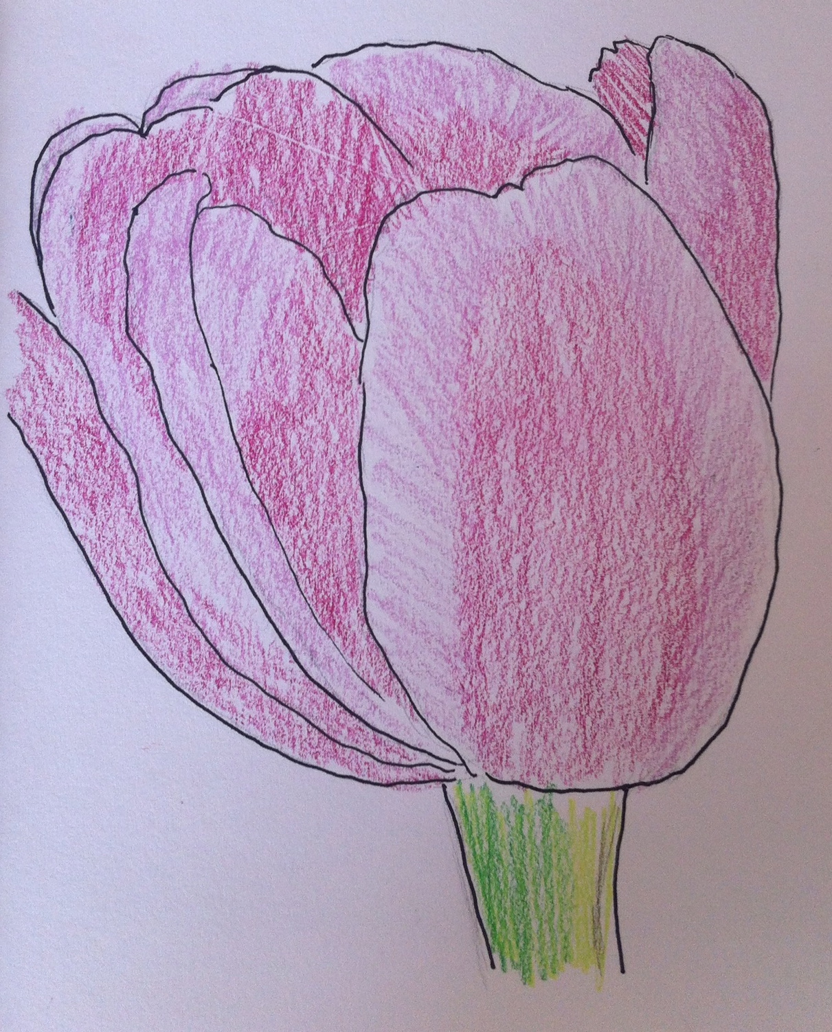
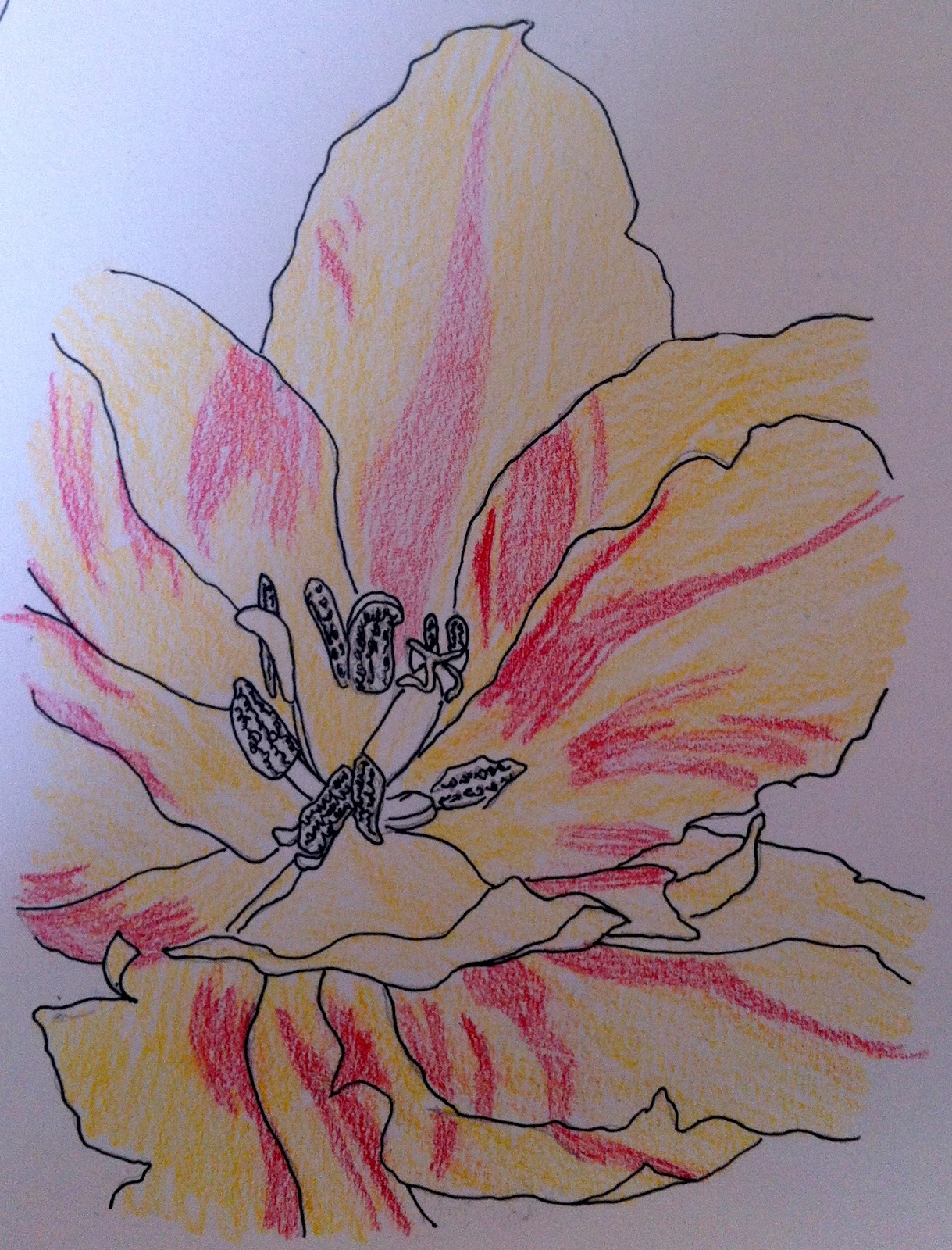
Still life using natural objects
The compositional workings out seem hasty and more consideration could be given to the placement on the final sheet, again, I re-iterate, proximity, point of view, and light source are all considerations that should be made at this early stage of planning. Think about every stage of making. The quality of the mark, the objects/subjects, how you will render them? All are questions that we as artists have to answer.
The ‘workings out’ of the colour pencils are basic but descriptive of the difficulties of this medium. More work is needed on the cross hatching of different colours to create tonal variation. Where is the light source? If it is coming from the left hand side, ask yourself how has that affected the subject matter? Have I indicated this to the best degree so as to inform the viewer?
Colour pencils are extremely difficult to handle at this stage in developing your visual language, however, you have really worked hard at using them especially within this final piece. This work is vibrant; the intensity with which you have used the medium is suitable for the subject. Because this is on line and I have not seen the work in the flesh, so to speak, make sure that the pencil work is as crisp as the jpg suggests. A good attempt at this stylistic approach. This type of photo-realism necessitates a rigorous attention to the way that you use the colour pencil. Have a look at other artists working with Photo or hyper realism. There is much on the internet to inspire you.
Still life using man made forms
Again I would have liked to view your preparatory workings out for the final study. The under drawing of the ball and the shoes is good. However, the colour work detracts from the drawing. My advice would be to work further on this drawing to resolve the background. The stripy blue and umber wallpaper reduces the foreground, and therefore the ‘eye’ of the viewer cannot take it all into account. If you took it back in terms of intensity or perhaps throwing it into shadows, but above all reduced the ‘stripyness’ of it, this work would be better acceptable. Make sure when altering it that you spend time thinking about whether you have to compensate the drawing in the foreground or not? The reflections of the ball in the foreground are working well, as are the holding shadows for the shoes. Choosing soft pastel as a medium is a hard task-master and you have made a good attempt. Should you wish to put this into the formal assessment you will need to work further on it taking into consideration my remarks.
Learning Logs/Critical essays/ Suggested reading/viewing
In order to reflect on your own work, it is necessary to reflect on the work of other artists contemporary and historical. You would really benefit from viewing the works of other artists Write about what you are seeing and interpreting, When you can see that an artists’ work represents what you are experiencing in your making, write about why that is happening, what has the artist done and how have they done it, how can it inform your own study?
Get into greater depths using a critical language.
If you can obtain this book, try to read it. Berger, J (1972) Ways of Seeing, Penguin Berger, it unpacks what it is to look and perceive. I re-iterate try looking on-line in places such as the Tate archive to see more drawing or for contemporary work: http://www.drawingroom.org.uk/ and also http://www.axisweb.org
www.balticmill.com/links for contemporary works.
The OCA website has good information on the learning log and its benefits.
Pointers for the next assignment
Take into the next assignment your explorations with colour, and most particularly the more spontaneous, descriptive mark making. Explore more, develop ways forwards in your sketchbook, this is critical to your advancement. Pay attention to the tonal values within your work, you can afford to be more rigorous with the tonal scale.
Formal Assessment
You may want to gain credit for your achievements by formally submitting your work for assessment at the end of each unit. Tutors at the OCA are just as keen to support you whether you study for pleasure or to gain qualifications. At Assignment 2 please indicate if you would like to go forward for formal assessment.