Category Archives: Part One – Mark making and tone

Enlarging an image

Enlarging and existing drawing

This exercise was about drawing an image on a grid and then enlarging the image by replicating it in a large grid size.

Below is my first attempt using a simple mug.

The next drawing below included a few objects grouped together.  The most challenging thing for me was to replicate both sides of the cookie jar evenly, which is not the case in the smaller version.  It helped to have the grid when checking the size and proportion of the objects in relation to each other.

How successful were you in copying the lines from the smaller squares to the larger squares?

I think in the simple cup it is not as accurate as it could be and I probably focused more on the shape of the ellipse than the positioning within the grid.  I feel that the second sketch with more objects was more successful. 

Are you satisfied with your larger replica of the image?  What would you do differently another time?

When I practise this next time I will try a bigger enlargement because I think this is when the grid becomes a really useful tool.

Using texture

Experimenting with texture

This was a fun exercise, trying to create different textures using many different mediums.  I filled a page with 5cm squares and chose a texture for each one.  I collected as many different items as I could find and tried to match the medium I thought most appropriate to each one.  The textures included a wicker basket, grass, onion skin, dog fur, wood & bubble wrap.

I then went on to experiment by taking the paper and charcoal and soft pencils outside to the garden.  Here, I took rubbings of stone flooring, tree bark and leaves.  The textures that didn’t work that well were a woollen jumper, kitchen roll and stucco wall covering.  I noticed that soft fabrics were not suitable for this kind of rubbing.

Below is an illustration I made using frottage as the background with a pen gecko filled with mark making ideas.  

A drawing with textures

Below is my composition using textures.  I chose my daughter’s flip-flops which had a smooth animal print contrasting with a shinier smooth golden surface.  The background was a zebra print duvet cover.  The pine cone provided scope for shadows and the coloured ribbons were made from a soft satiny material.  I used pen and ink for this picture and experimented with wet on wet for the ribbons to give a softer feel.  The background lacks detail and depth but it does provide a backdrop without overshadowing the detailed objects in the foreground.

Check and log

Have you discovered any new ways of using your drawing tools to depict surface and texture?

I wouldn’t have thought of using frottage to create detail and texture in drawings but I think this could be quite effective.  I think experimenting with different mediums for each texture opens up the opportunity to create many more styles of mark making.  

How successful were you at implying form with little or no tonal hatching?

I substituted hatching in the above picture with ink tones and tried to imply form with shading and tone.

What are your impressions of frottage as a drawing technique?

I love the idea of using frottage to create texture and depth in a drawing.  It is idea for backgrounds and filling larger areas that don’t necessarily have strict boundaries.  I shall definitely try to use it in further investigation work.

Still life

Project Still life

For this first still life example I choose to draw a simple composition.  Spring blossom on a bowl with some fine bamboo blinds in the background.  This drawing, although simple actually had quite a lot of detail in the flowers and getting the shape of the bowl right was an important visual aspect that needed to be correct.

I used textured pastel paper for this drawing which was rather detrimental as it turns out.  It was too textured and when I tried a rubbing from the bamboo blinds for the background it didn’t work too well. I used a mixture of soft pencils which enabled me to obtain deep shadows for the inside of the bowl.

Exercise Still life group using line

This is my rather poor attempt at a still life drawing using line.  To start with I was happy with the proportion of the objects in relation to each other and their size and shape.  Actually,  I feel now, that the composition should have been different, it is not dynamic in any way.  I struggled to add detail with line, especially on the watering can as it has a smooth surface.

I started this drawing by roughly outlining each object and then started adding detail with the black pen.  The plant on the right is roughly ok but the rest of the drawing seems very basic and unfinished.  I added the colour to mask the lack of skill in this drawing.  Unfortunately, I did not have time to redo another drawing but fully plan to at a later date.


Exercise Still life group in tone

I attempted this exercise in pastels working from the darkest tones first.  I was quite liberating after the precision of previous exercises.

I tried to vary the pressure and direction when working on the background and foreground.  I like the texture and colour variations, especially in the background.

When using pastels I found it difficult to keep the tones light and not overwork a piece.  With this piece I tried to focus on keeping white spaces and light tones, especially with the glass vases.   The flowers presented their own challenges, mainly when trying to create detail.  The pastels are thick and working in detail just ends up making more layers and smudges.

I feel that this piece is more an interpretation than a realistic still life but I am beginning to appreciate this style of drawing more than realistic still life drawings.

Check and log

What aspects of each drawing have been successful, and what did you have problems with?

I would say that the overall shape and proportion of the objects within the still life drawing are relatively successful.  The shading in the line drawing was lacking depth and looked rather basic and juvenile.  The overall effect of the pastel drawing is pleasant but probably could do with more detail and depth.

Did you manage to get a sense of depth in your drawings?  What elements of the drawings and still lfe groupings helped to create that sense.

For the Spring blossom drawing I think there is a feeling of depth created by the cast shadow of the bowl and the deep shadow inside the bowl.  The blinds were disappointing.

The plants drawing is flat and 2 dimensional and needs more directional light to cast shadow.  Each objects feels separate from the other and as a group of objects it doesn’t work.

What difficulites were created by being restricted to line or tone.

I found it easier to created a drawing when restricted to tone than just line.  With the line drawing I think if I had chosen an object that had more detail it would have been more successful.  Tone drawing is more instinctive and looser to work with creating impressions than realistic detail.

Reflected light

Reflected light

Study of light reflected from one object to another

For this exercise I tried different objects and different mediums. The first drawing on the left was in oil pastel.  I slowly built up the layers concentrating on the definite shapes in the reflections.  I drew the reflective outlines first and then started shading in colour.  I worked in 2 stages working a light cover for each object and then darkening the shadows in a second phase. In the drawing below, I found it very difficult draw the reflected light because the candle was, in hindsight, not a good subject choice.  It had a matt surface and was very pale in colour.

 I directed light from the right and found definite shapes in the jug.  I used conté crayons for this but regretted it after as I couldn’t get the detailed I wanted.  The crayons are wide and flat so it was very difficult to work in detail.  The mixer below was easier to draw as it was very shiny and had easy reflections to draw.  This was done using colour pencil and was a good exercise in blending.


 Again I used colour pencil for the drawing below tried to capture the reflections in the glass, which was a crinkle designed glass!  I find it easier to draw reflections in metal than in glass, which is hard to make it look realistic.  This drawing actually took a long time to complete.

Shadow and reflected light and shade


This is my attempt to use charcoal on a large scale.  I enjoyed using this medium and am becoming more comfortable with it and less afraid but there is a lot of progress to be made.  The shadows were actually quite like the drawing although it looks quite smudged instead.

I tried another go at shadows and light with a bowl of apples, this time with conté crayons.  Again this lacks detail but the apples do have a feeling of depth.  The bowl looks flat .

Negative and positive space

Patrick Caulfield simplifies his drawings to a very stylised and simplistic form.  I like his style although many of his paintings are quite different to the white ware series.  To emulate the feeling of his style I did some sketches of a bedside table with a light or alarm clock and then reduced them to simple forms.  The drawing below left, was done in colour makers and I tried to get a flat coverage of colour.

My second attempt was using tempura paint.  I may have simplified it a little too much but I quite like the result.

Check and log

What are the difficulties in separating cast shadow from reflected light and shade?

I found having to analyse this quite difficult and confusing although it has forced me to look more closely at what I am drawing and how the shadows have their own form.  I am not sure I am totally comfortable with this yet but it is something that constantly needs looking at in the development of my drawing skills.

The reflected shadow and light follows the contours of the objects.  How have you shown this in your drawing?

I am not sure that I totally understand this.  I have tried to look carefully at each object and defined reflected light areas precisely.

Tone and Form

Tone and form

Observing shadow and light formations on a surface

The purpose of the is exercise was to give objects a feeling of depth using shading. I used a few different mediums to practice tone and form.  I found it easier with charcoal pencils.  I also used several different hardness pencils on each drawing.  It was quite difficult to get an even tone.  I discovered that it is very important to really look at the objects and try to draw exactly what you see and not what you think the drawing should look like.

Tonal studies

The following drawings were an experimentation with hatching techniques.  I started with the four boxes to test different effects.  I then drew 4 apples using different pens and pencils to vary the effects of hatching.  It was useful to try and get different results using the same subject.  I then picked up various objects from home to practice giving a 3 dimensional form to the objects using just hatching.

I tried drawing a hand with this technique but the proportions are not really correct, nor the position of each finger.  I found this quite a difficult subject to draw.

Below is a drawing of a wooden dodo and a favourite pewter teapot of mine.  I chose to do this in colour pencil and spent a lot of time on it.  I really tried to limit the shading just to cross-hatching.  Unfortunately is is a little smudged from a pencil drawing on the opposite page but I am quite happy with the result.

In the drawings below tried to portray the casting shadow as accurately as possible.


Research point – Odilon Redon

I wasn’t quite sure what I was looking for when researching Odilon Redon so I choose this painting below because it had lots of tone and texture.

Unfortunately when I look at it now I can see that the head it far too small but the shading is not too bad.  I used oil pastels for this which is a very different medium to the original. 


This second drawing was made in soft pastels and pen but was very difficult as there was a lot of detail in the original.

Check and log

How difficult did you find it to distinguish between light from the primary light source and secondary reflected light?

I struggled with this quite a lot, especially as there was always natural light in the room and therefore reflecting onto the objects as well as the directed light. I really had to look and analyse where the light was coming from and how it projected onto each object.

How has awareness of light and shade affected your depiction of form?

These exercises have made me look far more when drawing and not just drawing what I think I see and expect my drawing to look like.  I need to practice and analyse light sources more to really understand this but it had created an awareness that is critical to future studies.

Basic shapes and fundamental form

Basic shapes and fundamental form

Boxes and books

I took boxes and items from home to put together for this exercise.  Getting the proportions right was the most difficult part of this drawing.  I tried to remember the principles of 2pt perspective for each object.


In this second drawing I started shading each object but actually half way through I thought that I should perhaps leave the boxes and show the pure shape.

I wanted to try a drawing in pen and ink.  I am pleased with the shape and relationship of the boxes in this picture. 

Jars and jugs

I made several sketches of these from different angles.  In this final sketch I am happy with the ellipses and general shape of the objects.  I noticed that some of the shapes lean towards the right a little.


Wine bottles are very difficult to draw.  This one leans again and is also not symmetrical.  I also made a drawing using copic markers, 5 shades of grey.  I tried to keep the shading directional to give a smooth effect.


Supermarket shop

I wanted to try a drawing in conté crayons and am fairly happy with this first attempt.  I found it difficult to work in detail as they are thick, chunky square blocks so I had to work with the corner edge for fine lines.  The round tub on the right is not the correct shape at all but the shading helps to create a little depth.  I have discovered pleasure in working with colour pencils and although it is very time consuming it is a medium I feel happy with.  This shapes in this shopping trip drawing are not as flat as they should be.


Check and log

Are the objects in your drawings the correct size and shape in relation to each other?

I am fairly happy with the size of each object and paid attention to the size of each object.  This was the most challenging part of this exercise.  Sometimes getting the objects to look flat on the table was also difficult and angles were crucial to this.

Do the shapes between the objects look correct?

I worked on these drawing by paying attention to each shape rather than the negative space but I did check these spaces as I went along.  

Do the objects in your drawings look solid?

The objects that have been shaded look solid with some depth although far from perfect.  The outline objects tend to look flat and 2 dimensional.

Have you managed to create the feeling of depth in your drawings?

I am happy with the cylinders drawing and feel that there is depth.  The objects were behind each other so this created the feeling of depth.  The pastel shopping drawing also has depth although the objects themselves are not particularly well drawn and as round as they should be.

Making marks

Holding pens and pencils

This first exercise involved holding pens & pencils in different ways to experiment with making marks and lines on the paper.

In my sketchbook I filled a page using a variety of tools, charcoal, pencils, gel pens, colour pencils.  I tried holding them in different ways and sometimes found it difficult to retain control over my strokes.

Dangling the pen over the paper tended to produce light uncontrolled strokes, as it was difficult to apply pressure to the pen.  When holding the pen at the tip control was easier but not particularly comfortable.

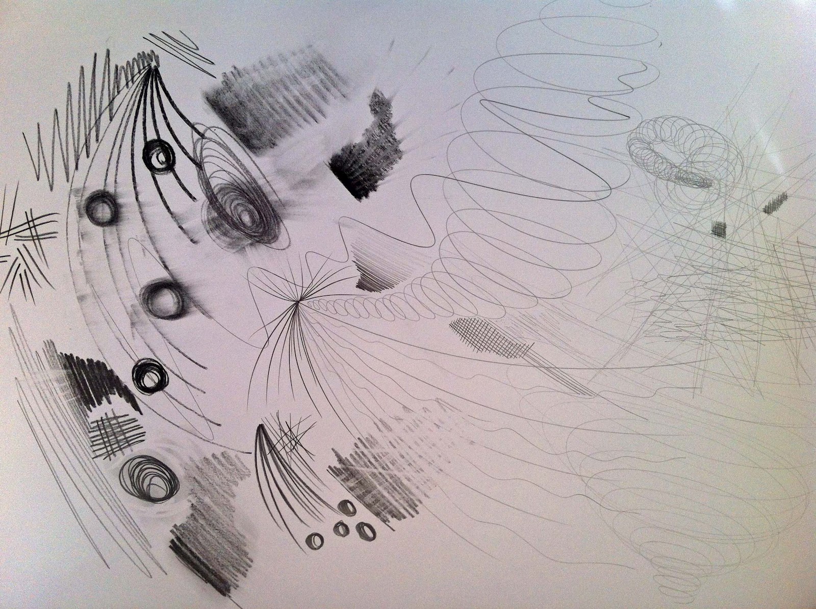
I took an A1 piece of paper and worked up some marks using large gestural strokes.  It felt very free and easy as I was not trying to contain the pen to create a particular shape.  I varied the pressure usually from hard to soft.  On such large paper it is easy to create large sweeping lines and circular 
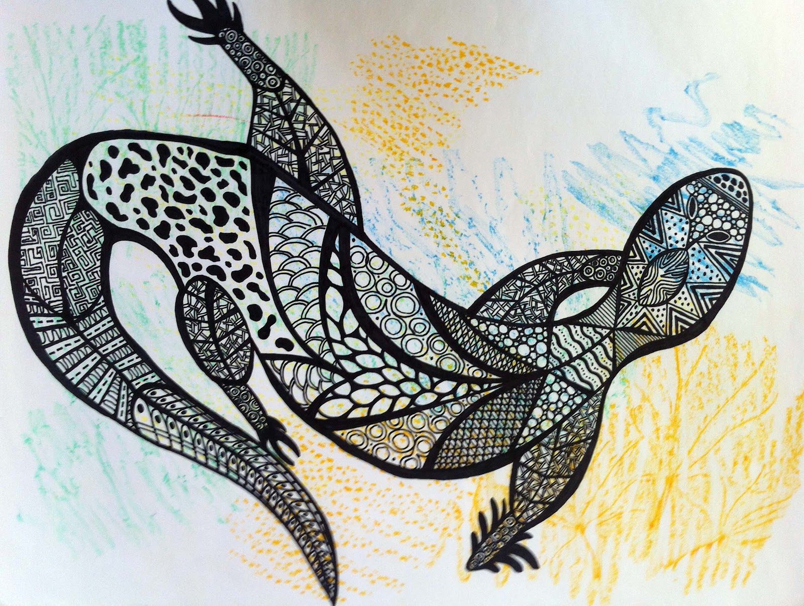
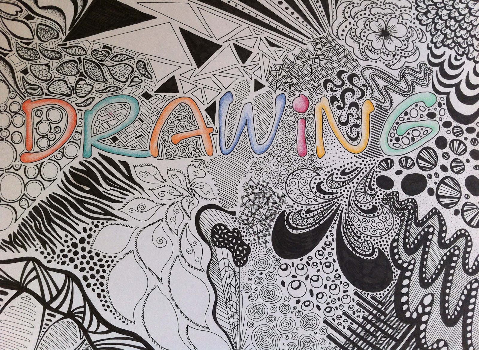
Doodling

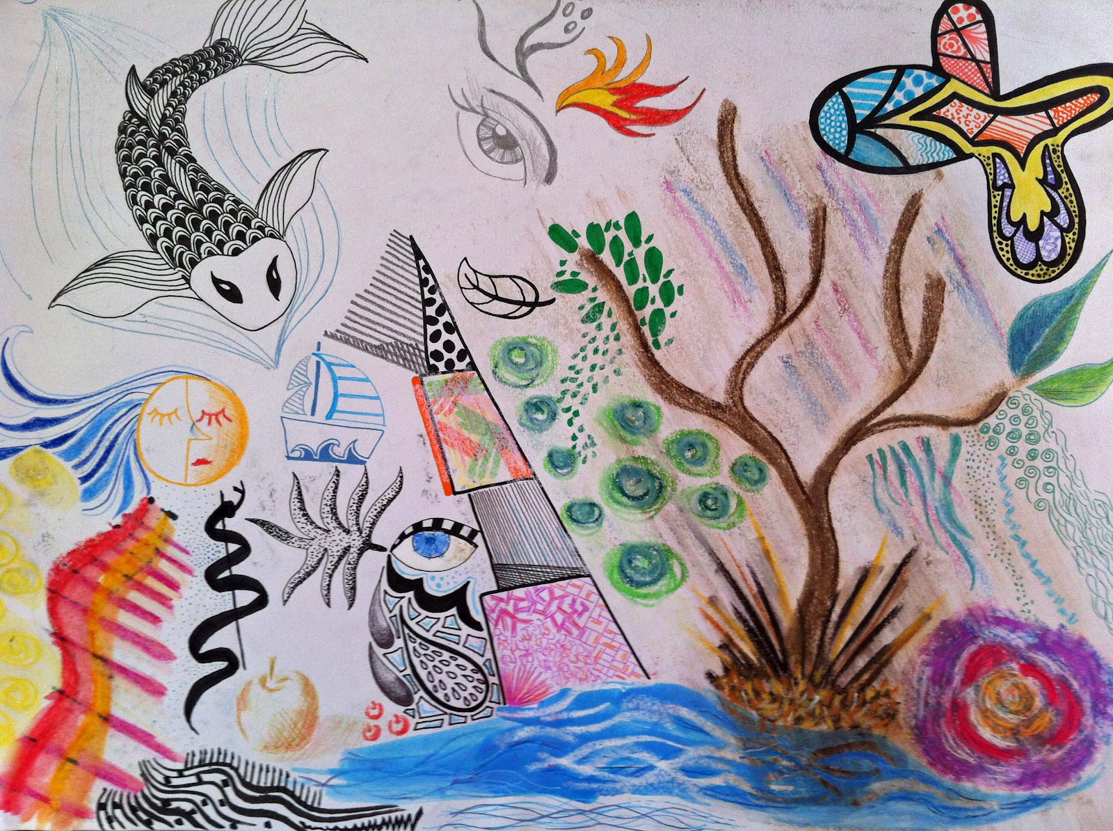
Here is an example of doodling using lots of different mediums.  I was listening to music whilst producing this and not really thinking of anything in particular.  I love doodling in general and it was enriching to use some many different pens and tools.

The next example of doodling was more precise with a few recognisable shapes and themes but again a just let the pens flow and take them where they wanted.  This is an interesting exercise just to experiment with each medium and how to make different effects.

The drawing below I did as a title page for my sketchbook.  It took a long time but I really enjoy this kind of doodling.

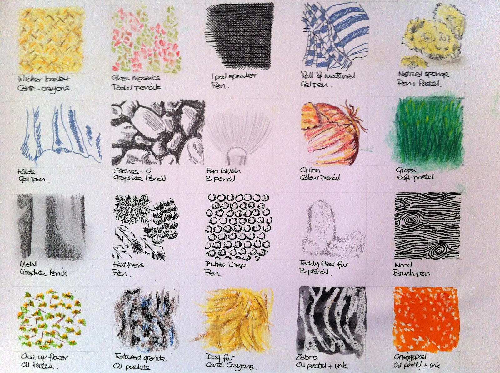
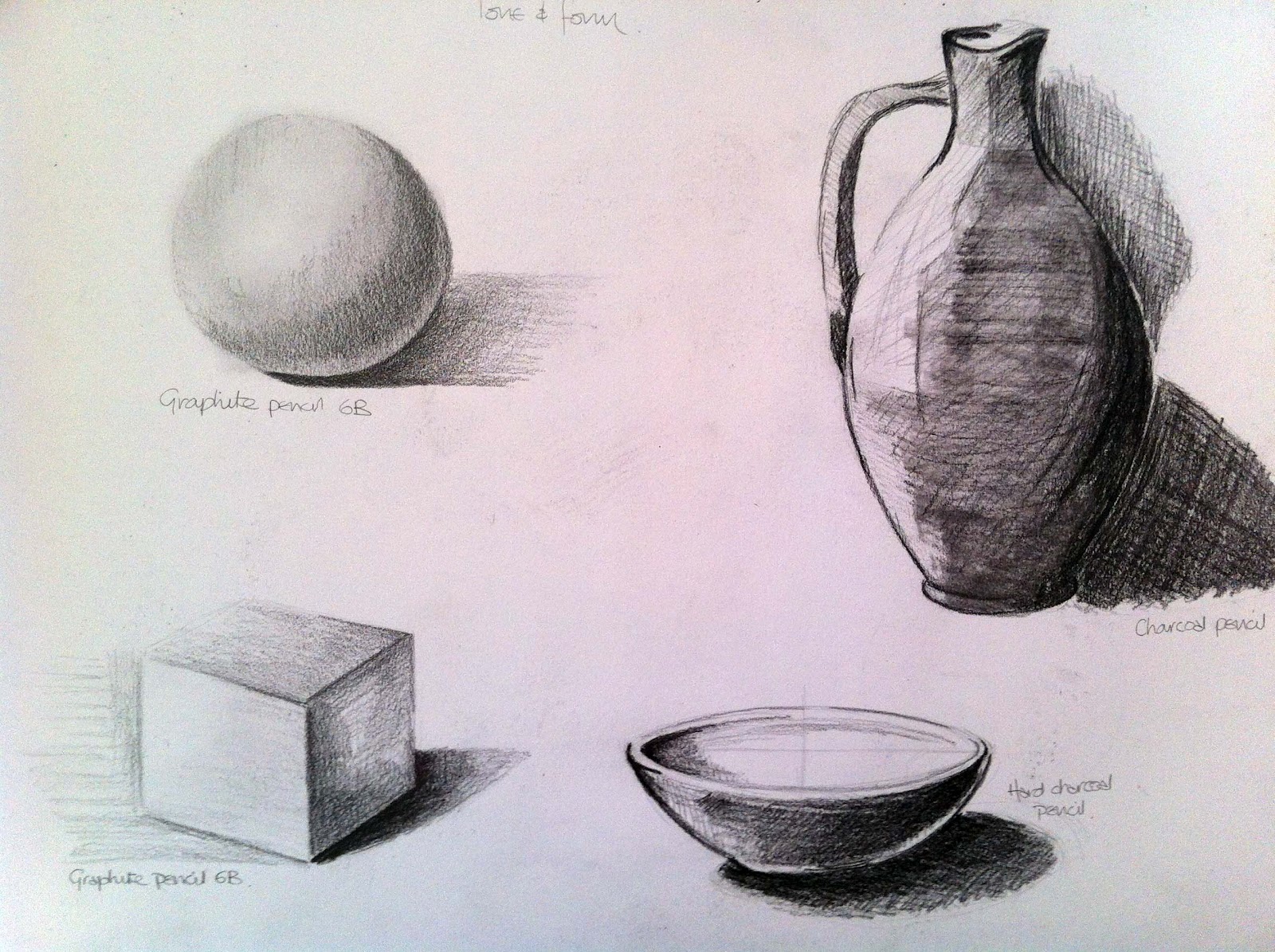
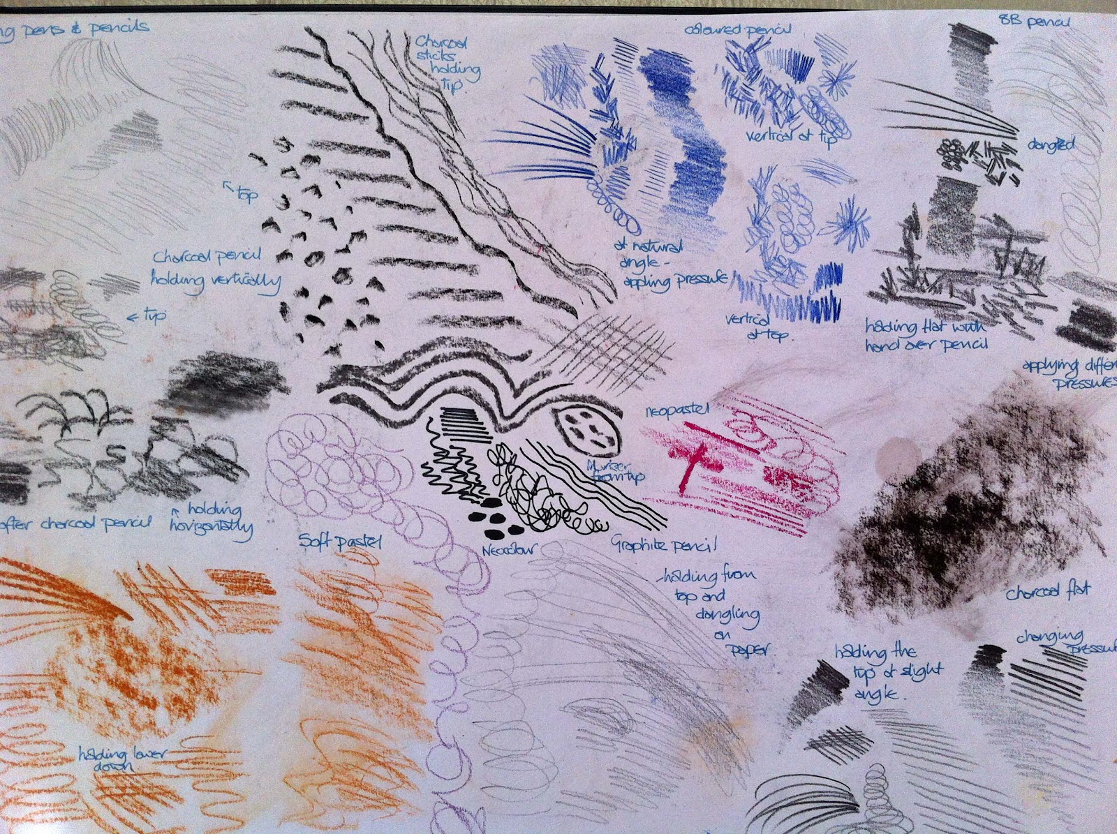
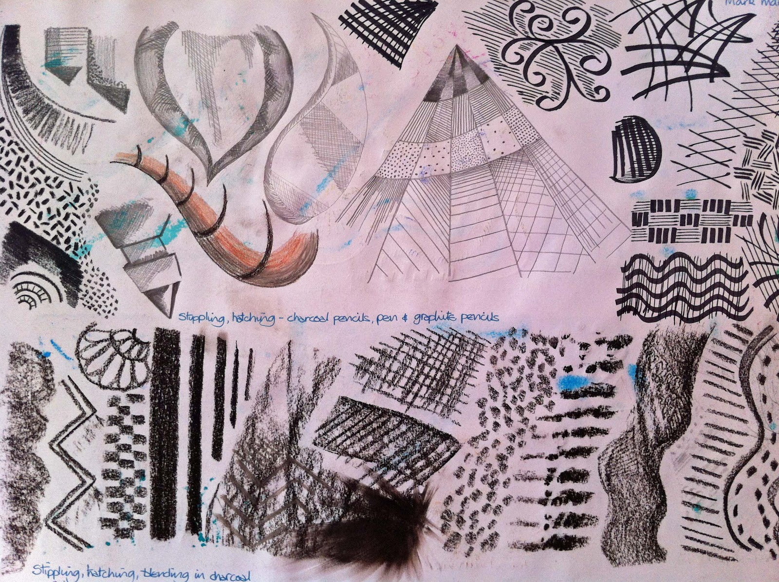
Mark-making techniques

When using the different pens and pastel etc.. it was interesting to note the effects that can be created.  Gel pens and sharp, hard pencils are good for hatching and fine line.  Stippling is also effective but shading a continuous light to dark is much more challenging.  Oil pastels are great for blending and producing blocks of colour but difficult to use for more detailed, precise work.  In these two pages I tried to use as many different tools in as many different ways to evaluate what technique works with each tool.

Charcoal is bold and messy but difficult for stippling or very fine detail.  Mixing media together produces another set of results.


Using charcoal

This first piece of mark making with charcoal is on an A1 piece of paper and I experimented by using the side, tip, corner of the charcoal to vary the effects.  I love the flat tonal marks and also the thin, grass like likes.  I hadn’t realised that I could get so many effects from the one medium and I discovered a pleasure that surprised me.  I guess I had always been a little afraid of charcoal and by starting simply it took some of the fear away.

On this next piece I tried to be as versatile as possible, each time trying to think how I could use charcoal in a drawing. I will try to mix it with ink and pencil as I think they could complement each other.

Line and other marks

Here I used different mediums together to create different effects and then decided to experiment using ink with twigs, bamboo, chinese brushes, sponges.  I loved this exercise and the sweeping freedom of it.  I tried some resist with a candle before the ink and also splatting ink on the paper and then blowing with a straw.  This has been a fun start to this course and immensely useful as a reference for different mediums and their effects.


Research point – Van Gogh

Van Gogh was a mater of mark making managing to create feeling of movement and gesture through his line and brush strokes.  Here is a copy of one of his outdoor scenes and I found this actually more difficult to do than I had anticipated.  I am left handed and sometimes the shading just doesn’t go in the right direction for me.  

I tried another of his drawing this time with permanent pen and ink.  


Check and Log

How did holding your pen or pencil in a different way affect your drawing?

Holding the tip of the pen, I found it difficult to maintain control and apply pressure.  This maybe useful for a loose layer of light colour or for light shading.  Holding charcoal and conté crayons sideways enabled me to create lovely shades of block colour.  Holding pencils almost sideways was good to shading thicker blocks of colour as keeping the pencil upright was used for stippling.

Which drawing tools suited the different mark-making techniques you used?

Gel pens, sharp pencils, pens for fine lines, stippling, hatching.  Charcoal and pastels for blocks of colour and shading and blending.  Ink for sweeping, flowing movements.  I found that many of the tools overlap in their use and can be manipulated in many different ways.

Did you find that any marks or tools matched particular emotions or feelings?

I found that the ink with large brushes and sponges evoked spontaneity, freedom and general well-being.  Charcoal was versatile for me, it can be dark and almost threatening but also calming.  Fine pens can be quite intense and almost stress making.

How did the introduction of colour (soft pastels, Conté crayons) affect your mark-making?

 I found this led to more creativity and expression.  I was able to experiment by mixing mediums and therefore create different marks and effects.  

Which of these experiments have you found the most interesting and rewarding?

I especially enjoyed the charcoal and ink mark-making and found that I learnt a lot from experimenting with them.  I also found it interesting to work on a large scale which forced me to loosen up and become more expressive.