Landscape Drawing Research Point
Albrecht Durer’s landscapes, whether woodcut prints or painted are full of detail and mark making and he creates depth and form with this intricate details. He uses detail in the foreground and leaves white spaces in the background giving the illusion of depth. His painting of the foliage is a beautiful example of detailed work in colour with a skillful use of fine whitish lines to separate the leaves.


Claude Lorrain, 1600-1682 approx. also painted in a realist style with minute detail. His work is smooth and blends so well that we cannot see any brush marks.
John Constable’s work in comparison (below) is looser and less formal in style. Although realistic with a distinct foreground, middle ground and background and correct proportions it is definitely less rigid and structured.


When it comes to L S Lowry there is totally another style of painting. The colours are muted and vibrant within one piece, especially on the right hand painting. He creates a sense of depth with colours getting lighter in the distance and by using less detail. He isn’t concerned with the correct perspective in the buildings but this is what gives his work that unique style.
A sketchbook walk
 For this exercise I choose to take my sketch book around the golf course. It is often very quite during the week and I was able to sketch peacefully and above all not bring attention to myself. It was an sunny/cloudy day so the light was quite flat without much shadow. I tried to focus on points of interest such as a bench, fountain and signposts.
 I started with the fountain for washing clubs. This was my first experience of drawing outside so I was very self conscious and trying to hide myself from curious onlookers. This scene had the challenge of water which I found difficult to draw. I concentrated on the foreground of the fountain itself and just draw a vague shape of the hedge in the background.

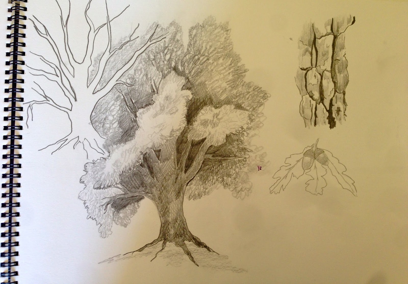
Next I moved on to the start of the main course and drew the signposts. There was a tree behind on a little hill so I tried to include the dark shadow underneath, by this time, the sun had come out. I think I need to be more distinctive in the type of mark making for each different texture. The grass is short and spiky but could be more defined. There should also be a shadow coming from the signposts. Maybe I was drawing to quickly, trying to get out of a busy place.
The bench was located in a quieter more shady part of the course and that day it was very wet underfoot.
I tried to draw the trees behind the bench in a ragged way and a wispy shadow from the bench as it was not at all defined. My main concern was the shape and proportions of the bench itself.
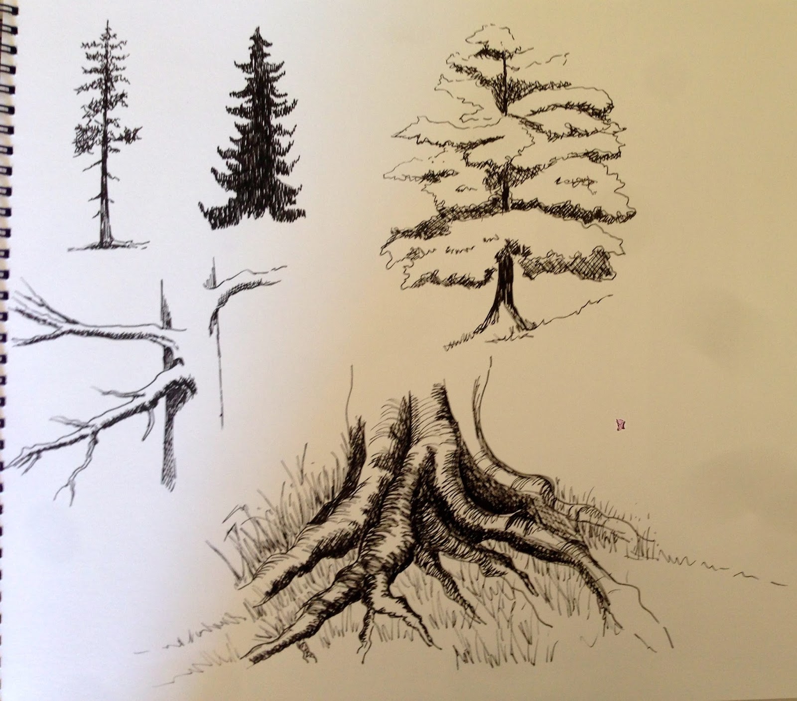
The last area was walking back to the clubhouse on the small course. There was a path with a very uneven wire fence with small clumps of violet flowers growing in the grass. I tried to get the feeling of perspective with the trees in the background. These trees were a lot darker. The fence posts were placed randomly and all shaped differently which is what appealed to me. I feel, at least, there is a feeling of distance in this sketch.
Exercise 360° studies
These sketches were done in Portugal, again on a golf course on the 9th hole. It was a overcast day that gave way to storms later on. I spent a lot more time on each of these sketches and tried to use a variation of mark making to interpret texture.
 The first scene looks out to the ocean in the distance. I spent a lot of time trying to draw detail in the bark of trees, bushes peeking through the small fence. The horizon of the ocean gives the feeling of background.
 Turning 90° the next scene depicts just the edge of the green and a mound with trees and shrubs. The tree on the right has more detail and therefore helps to depict the foreground. The bushes at the back should maybe have been lighter to show the distance. These drawing are actually quite a bit more detailed than before and more precise, more in my comfort zone.

This drawing is meant to show a huge ravine between the bushes in the foreground and background but I struggled to show this properly. The trees in the background should have been lighter to create the feeling of distance. I need to finish the grass in the foreground but ran out of time. As I have taken photos, I can finish this if necessary any time.
 This view is looking down the fairway with the green in the foreground. I messed up the short grass of the green and wasn’t sure how to put it right. It had been cut showing the grain in the grass but the angle is all wrong. The trees seem to be all on one plane and not fading into the distance.
In general the detail and mark making is better in these drawings but shading and shadows aren’t particularly successful.
Exercise Drawing cloud formations

This was a fun exercise and now I find myself looking at clouds and working out the best way to draw them in different mediums.
This first example on the left was made with a 5b pencil and a putty rubber. I tried making the clouds by taking out shading with the rubber. The paper is quite cheap and smooth so I could only take out so much pencil before it went a little shiny. Needs more practise.

The following 2 pages are samples of sketches using different mediums. For the top example I used charcoal from a separate piece of paper and rubbed it on with a tissue. I then created the clouds with the putty rubber: this seemed more successful and is good for wispy clouds which we often find over the Jura mountains where I live. We are lucky to have a view of the mountains and some very different cloud formations, so it is easy to sit at the window and sketch them. I also tried drawing clouds with an 8B pencil but was disappointed with the blending.

The bottom left samples were made using a paper template and rubbing with tissue covered with charcoal. Interesting and fun but needs refining as they don’t yet look like clouds.

I then tried with charcoal again and added shadow above the clouds as the light source was from below. Again it was difficult to take out all of the charcoal to get enough white.
Below is an example using soft pastels on a light beige paper. This was the most fun to do and very messy. It was fun to put the white on top of the darker colours instead of taking out with a rubber. I also tried using oil pastels but couldn’t get them to blend at all.

Exercise Plotting space through composition and structure
On the left are some preparatory sketches for this next exercise. I decided to go back to view in the south of France and also worked from photos.
The sketches are quite detailed here.
I used A3 paper and took a whole view to represent the fore, middle and background. The mountains in the back are softer with no detail and less defined.
The middle ground could have been a little more distinct but I couldn’t get the foreground any darker and didn’t want them both to appear the same.

I perhaps should have chosen another view or made the foreground much more detailed but I was a little lazy and didn’t want to spend hours on every detail. The main thing for me was to understand the concept and how this type of perspective works.
Research Point
Claude Lorrain and Turner:


The Claude Lorrain paintings above are lovely examples of how objects and landscape fade into the distance. The colours in the foreground are very deep and intense. The details become less important as things disappear into the background. He always seems to have a distinct horizon line, using pale colours for the sky.
I found it less obvious to distinguish the back, middle and foreground of Turner’s paintings and had to look through a few to find good examples. His work is almost more abstract and ethereal and therefore less rigid and obvious in format. The painting below left has distinct fading as object disappear into the background. There is in both paintings a marked horizon line and less detail from the middle plane.


Check and Log
I simplified my study too much and didn’t put enough detail into the foreground. I didn’t realise it had to be a precise piece of work and thought I was practising to understand concepts, so my drawing remained in sketch form. I now appreciate the value of fore, middle and background and how to achieve this within a drawing or painting. Light and shadow is important and was highlighted much more when looking at the clouds, which was very interesting. I will, if I get time, go back and practise much of what I learnt in this chapter.