Category Archives: Part Two – Observation in nature

Drawing animals

Exercise Grabbing the chance

With four cats and a golden retriever in the house I have a certain amount of choice when it comes to sketching animals, although they don’t sit still for long, too many friends to play with.

Zack, our golden, here below is a drawing attempted in soft pastels.  It actually looks like him, which is a bonus, although I am not very happy with the ear.  I am happy with the face and details in the mouth. The ear went wrong early on and I found it difficult to recuperate, adding more layers just resulted in a dirty, murky area.  I bought some pastel pencils to acheive the detail, they make a huge difference.

I started this drawing by sketching Zack as he was ‘talking’ to my husband but worked on it from photos for the colour and details.


 I tried various different mediums for the following sketches; conté crayons, graphite pencil and soft pastels.  The cat above left was drawn using soft pastels, white and black.  Unfortunately the paper was too textured and I lost any detail.  All of these sketches were done on pastel paper, but I am not a huge fan as it is too textured and grainy which detracts from the drawing.  Not sure what the advantage of this type of paper could be.

I enjoyed drawing the animals and prefer them to still life drawings apart from flowers.  There seems to be more character to capture.

Exercise Fish on a plate

I really didn’t enjoy doing this piece at all and it shows in the result.  I couldn’t get the detail or shading and just hate the whole thing.  I forced myself to continue but  consider this piece a total failure.  Drawing the broad shapes was ok but the painting and shading just got the better of me.  Yuk, time to move on!!  Maybe I should wait a while and go back, working in some detail with colour pencil.

Check and log

What were the main challenges of drawing animals?

Keeping them still enough to get the main outline sketch.  Rendering the detail and also the fur, texture of them.  Capturing the character of each animal.

Which media did you enjoy using most and which did you feel were best for the subject matter and why?

Soft pastels or soft graphite pencils seemed to be the easiest media for me.  They seem apt for loose drawing and spontaneous sketching.

Where can you go to draw more animals?  Think about the sorts of places that will give you opportunities for animal drawing.  Have you tried drawing a moving animal yet?

I could go to the lake side to find ducks and swans.  We also have bison near by and some deer in an enclosed field.  We also have a few local animal farms nearby, so opportunities are quite easy to find.  I tried sketching some ducks by the lake and found this quite difficult.  The advantage is that there were quite a few of them so as one moved I could find another in the same pose.

Drawing plants and flowers

Exercise Negative space in a plant

I enjoyed this exercise greatly and found that drawing negative spaces frees you from the idea of drawing what you ‘think’ you see and lets you draw what you ‘actually’ see.

I found that drawing negative space results in a more accurate drawing.  Space between leaves and the actual shape of the leaves are more true to life than if I had drawn it the other way around.

I like simplistic styles and contrasting black and white, so visually this type of drawing is very pleasing to me, even as a finished piece.

Exercise Plants and flowers in colour pencil

I started this exercise by sketching different flower heads using various methods of shading; blending, hatching, mark making.  I like using colour pencils and feel quite comfortable with them, it seems to be a medium I can control.  I like working in layers and building up tone and value slowly.

The flowers drawing for this exercise is a work in progress.  I have spent quite a few hours on this already but to do it justice it needs more time, which I fully intend to give a later date.

Exercise Drawing with other colour media

This piece was a mixed media experiment using oil pastels, watercolour and chink ink pen.  I started with a light pencil outline of each flower and leaf and then tried to work spontaneously mixing layers of oil pastel and watercolour.  I finished with pen outline when the piece had dried throughly.  I enjoy creating pieces that are more stylised and less rigid although I don’t pretend to have developed any style of my own yet.  I am beginning to appreciate that hours of practice and experimentation are essential to any success.

The above pictures were made using marker pens and soft pastels, trying to mix the mediums in one drawing.

Drawing fruit and vegetables in colour

Exercise Using hatching to create tone

I started with a pencil sketch of some lemons.  Using a soft pencil and very small strokes I tried to look closely at every aspect of the surface of each object.

I tried to concentrate on hatching and cross hatching rather than blending but this isn’t a natural way of drawing for me.  I tend to work in very small detail rather than obvious hatching.

I then moved to colour pencil, which I kept very sharp and focused mainly on the hatching technique.

I choose a pear and a banana for my first two sketches.  The pear shows larger hatching marks but doesn’t necessarily follow the contours of the surface.  It gives a very sketchy effect.  The banana has a little more detail and I think reflects the depth and shadows a little better.


 This drawing on the right of an apple was done in colour pencil.  I tried hard to follow the contours of the rounded shape and respect the darker shades and highlights.  I maybe should have added some cast shadow.

I also tried a couple of sketches using colour pencils with water but disappointingly the paper wasn’t  very good at helping the ink to run.

It was good experience but not a good result.

Exercise Using markers or dip pens

 I really enjoyed experimenting with marker pens.  I liked the medium and creating something more graphic and stylised.  The first sketch of pink grapefruit is simple but quite effective.  I discovered though that the paper makes a huge difference.  On absorbent drawing paper the pens flooded and bled leaving lots of stroke marks.  I tried several different papers whilst experimenting with marker pens.

I then tried a bunch of bananas and put a black contrast background to highlight the fruit.  I only had a small colour selection of pens but tried to create tone and shading with colour, adding some green to the bananas.  I also added some fine black detail to enhance the drawing.

This last drawing on the right was made with felt-tip pens and water.  It was my first experiment with this medium and can be quite tricky to use.  Unfortunately, I used low quality drawing paper which absorb the water and made it difficult to spread the colours in a controlled manner.

Looking back at these drawings, I am beginning to like close up, heavily cropped images as they have more impact and seem to be more dynamic.

Exercise Drawing using oil pastel

This oil pastel drawing took a long time in several sessions.  I worked from dark to light blocking in the defined colours first.

The quality of the oil pastel wasn’t great as they are virtually the cheapest on the market and proved to be quite crumbly and soft.

The thing I struggle with in oil pastels is detail and building up layers.  Details prove to be difficult because of the thick rounded ends.  I tried shaving the pastels into a point but they crumbled at the slightest pressure.  Layers were challenging because the pastels created a thick skin even if I tried to build layers lightly with hardly any pressure.

This drawing above lacks both detail and some shading, especially on the bananas.  The Lichee lack depth and appear incorrect in form and the banana on the left is completely the wrong shape.

Research Point

Artist biography

Nicholson was born in Denham, Buckinghamshire, and was the son of the artists William Nicholson and Mabel Pryde. He studied at the Slade School of Art, 1910-11. He spent 1912 to 1914 in France and Italy, and was in the United States in 1917-18. He married the artist Winifred Roberts in 1920. Over the next three years they spent winters in Lugano, Switzerland, then divided their time between London and Cumberland. In 1931, Nicholson’s relationship with the sculptor Barbara Hepworth resulted in the breakdown of his marriage to Winifred. He and Hepworth married in 1938 and divorced in 1951. Nicholson lived in London from 1932 to 1939, making several trips to Paris in 1932-3, visiting the studios of Picasso, Braque, Arp, Brancusi and Mondrian. From 1939 to 1958 he lived and worked in Cornwall, before moving to Switzerland. He returned to London in 1974.

Nicholson’s earliest paintings were still lifes influenced by those of his father. In the 1920s he began painting figurative and abstract works inspired by Post Impressionism and Cubism. He produced his first geometric and abstract reliefs in 1933. He first exhibited in 1919, at the Grosvenor Gallery and Grafton Galleries. His first one-man show was held at the Twenty-one Gallery, London in 1924. From 1924 to 1935 he was a member of the Seven and Five Society, and in 1933 he joined Unit One, founded by Paul Nash. In 1937 Nicholson, Naum Gabo and the architect Leslie Martin edited Circle: International Survey of Constructive ArtCircle identified Nicholson with a group of like-minded artists and architects who wanted to apply ‘constructivist’ principles to public and private art, advocating mathematical precision, clean lines and an absence of ornament.

In 1952 Nicholson won first prize at the Carnegie International, Pittsburgh. He was awarded the first Guggenheim International painting prize in 1956, and the international prize for painting at the Sao Paulo Bienal in 1957. He received the Order of Merit in 1968. Numerous retrospective exhibitions of his work have been held, including shows at the Venice Biennale and Tate Gallery in 1954-5, Kunsthalle, Berne in 1961, Museum of Fine Arts, Dallas in 1964, Albright-Knox Art Gallery, Buffalo in 1978, and Tate Gallery in 1993-4. Helped by wide international exposure in British Council tours during the 1940s and 1950s and by the championing of the writer Herbert Read, Nicholson’s work came to be seen, with Henry Moore’s, as the quintessence of British modernism.


Check & log

Your composition should occupy most of the paper’s surface.  How much negative space do you have left?

My drawings for this part of the course vary in composition.  The first sketches in pencil are single fruit without much thought of where on the page or composition.  I wanted to practice technique rather than a full still life composition.  The markers drawings have very little negative space as they are cropped tightly.

What have you learned from drawing the details of fruit and vegetables?

It is a long, laborious exercise if you want reflect the surface of the fruit correctly and add each detail of surface texture and shading.   

What did you find challenging about this part of the course?

Time, I struggled to find the time to work in such a detailed manner.  Using new materials such as oil pastels.  It takes time to adjust to new materials and needs a lots of experimentation.

Still life

Project Still life

For this first still life example I choose to draw a simple composition.  Spring blossom on a bowl with some fine bamboo blinds in the background.  This drawing, although simple actually had quite a lot of detail in the flowers and getting the shape of the bowl right was an important visual aspect that needed to be correct.

I used textured pastel paper for this drawing which was rather detrimental as it turns out.  It was too textured and when I tried a rubbing from the bamboo blinds for the background it didn’t work too well. I used a mixture of soft pencils which enabled me to obtain deep shadows for the inside of the bowl.

Exercise Still life group using line

This is my rather poor attempt at a still life drawing using line.  To start with I was happy with the proportion of the objects in relation to each other and their size and shape.  Actually,  I feel now, that the composition should have been different, it is not dynamic in any way.  I struggled to add detail with line, especially on the watering can as it has a smooth surface.

I started this drawing by roughly outlining each object and then started adding detail with the black pen.  The plant on the right is roughly ok but the rest of the drawing seems very basic and unfinished.  I added the colour to mask the lack of skill in this drawing.  Unfortunately, I did not have time to redo another drawing but fully plan to at a later date.

Exercise Still life group in tone

I attempted this exercise in pastels working from the darkest tones first.  I was quite liberating after the precision of previous exercises.

I tried to vary the pressure and direction when working on the background and foreground.  I like the texture and colour variations, especially in the background.

When using pastels I found it difficult to keep the tones light and not overwork a piece.  With this piece I tried to focus on keeping white spaces and light tones, especially with the glass vases.   The flowers presented their own challenges, mainly when trying to create detail.  The pastels are thick and working in detail just ends up making more layers and smudges.

I feel that this piece is more an interpretation than a realistic still life but I am beginning to appreciate this style of drawing more than realistic still life drawings.

Check and log

What aspects of each drawing have been successful, and what did you have problems with?

I would say that the overall shape and proportion of the objects within the still life drawing are relatively successful.  The shading in the line drawing was lacking depth and looked rather basic and juvenile.  The overall effect of the pastel drawing is pleasant but probably could do with more detail and depth.

Did you manage to get a sense of depth in your drawings?  What elements of the drawings and still lfe groupings helped to create that sense.

For the Spring blossom drawing I think there is a feeling of depth created by the cast shadow of the bowl and the deep shadow inside the bowl.  The blinds were disappointing.

The plants drawing is flat and 2 dimensional and needs more directional light to cast shadow.  Each objects feels separate from the other and as a group of objects it doesn’t work.

What difficulties were created by being restricted to line or tone.

I found it easier to created a drawing when restricted to tone than just line.  With the line drawing I think if I had chosen an object that had more detail it would have been more successful.  Tone drawing is more instinctive and looser to work with creating impressions than realistic detail.

Detailed observation

Detailed observation

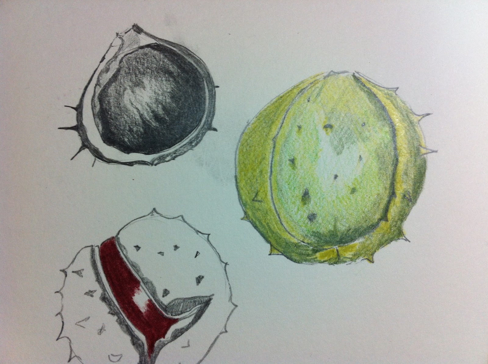
For the following drawings and sketches I choose to study horse chestnuts.  I started with some pencil sketches, as detailed as I could mixing colour pencil as well.  The aim here was to observe the shape and proportions accurately.  I choose pencil as it is a medium I am familiar with and also a good starting point for sketching.

I can only work with sharp pencils which made the shading and detailed lines sharper.

The next piece was a colour pencil drawing.  Here I tried to observe form as well as tone and texture.  I used many different colours to build up the green husk and for the chest nut itself, I varied reds, browns and some black.


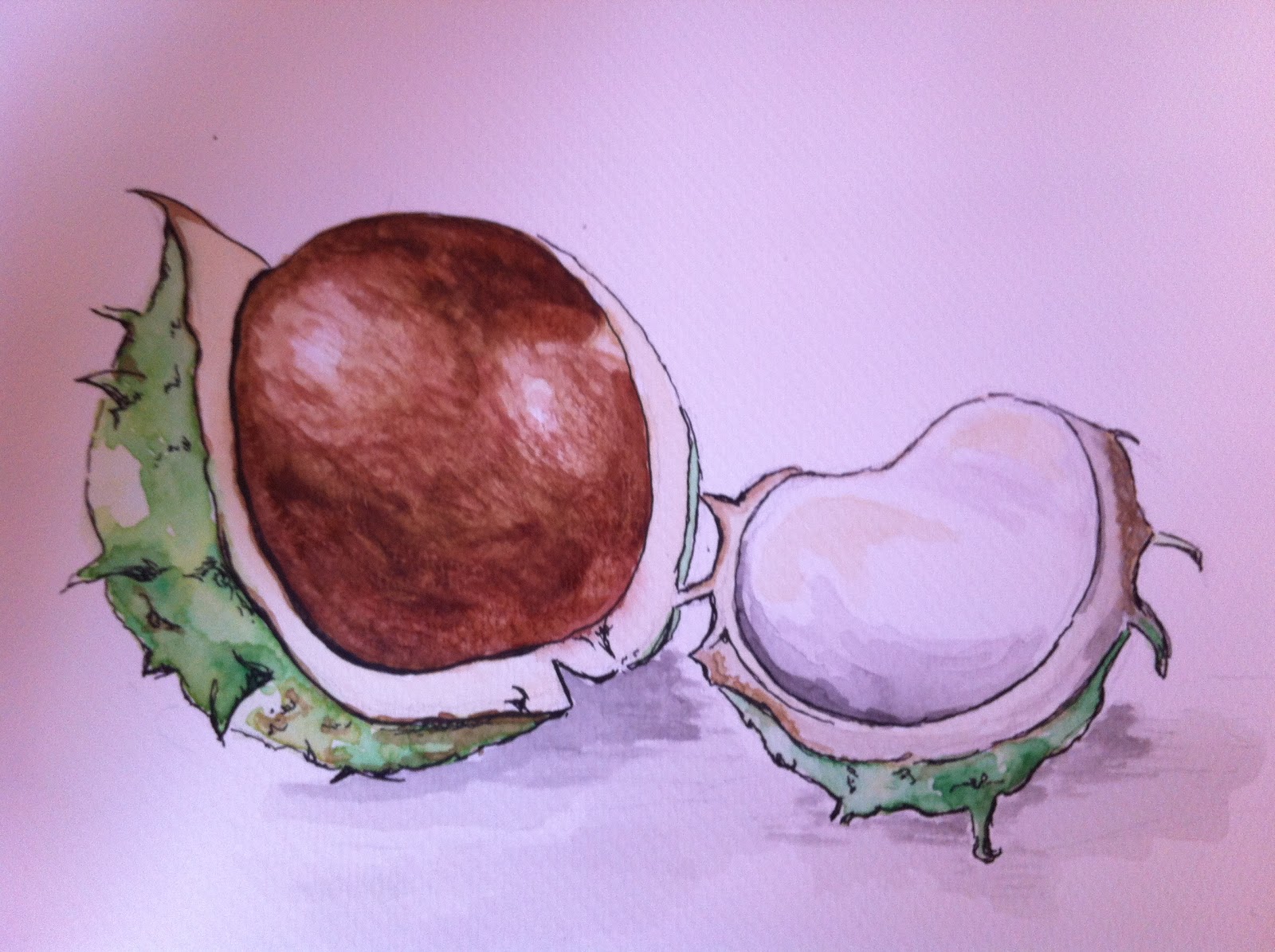
I then move on to experiment with pen & watercolour.  This is medium that appeals to me.  I enjoy its translucent effects mixed with the detailed and contrasting black of the pen.

I found it difficult to obtain a smooth blend for the chestnut but enjoyed using the colours in a non uniform way for the husk and shadows.

Again, it was important to observe form and shape.

The drawing below was an attempt at using oil pastels.  This is the first time I have used oil pastels for a still life drawing and therefore quite a challenge.  I would say that this is more of an artistic interpretation than an accurate still life drawing but I am fairly pleased with the results.  I found it very difficult to draw details and work in fine details, oil pastels are just not meant for that, especially as these were quite a cheap brand.

I do, however, quite like the overall effect, and just the fact that it is free and expressive rather than detailed and precise.

Exercise Line drawing detail

For the following exercise I choose several pieces of fruit and vegetables that were in the kitchen.  I tried a couple of continuous line drawings in pencil just to loosen up and get in the flow of work.  I found that the more detail there was the easier it was to draw.  The pear, although extremely simple and almost bare of detail, was actually harder to draw than the pepper.  I think this is because shape and form are so important.  For the broccoli, I decided not to draw all the detail for each floret as I was worried it might ruin the whole drawing, I wasn’t confident it would enhance it in any way.

Exercise Getting tone and depth detail

For the exercise in tone and depth I choose to work from some fir cones, of which we have an abundance, in the garden.   These sketches below took a very long time to do and it was literally a case of building up tone slowly.  For the main image at the bottom I draw a very faint outline of the shape with an HB pencil, the rest of the drawing was made using soft pencils and graphite pencils.  I kept the soft pencils sharp and worked hard to get the depth using deep dark markings.  I had to take very small bits of putty rubber to erase some of the tone to create highlights.

I finished these drawings in several sittings, working on them for a while and then going back to them after a few days.  There is more tonal value from shading with softer pencils than from hatching and cross hatching.  This is due to the nature of the object and small detail rather than a conscious choice.

Research Point

Alwyn Crawshaw is an English watercolour artist who I have admired for many years.  A few years ago I was fortunate enough to visit his studio and meet him personally and to watch him work.  It was a great day and inspiring.  He immediately came to mind when asked to find an artist with a sketchy and expressive style.  I have several of his books and took some photos from these of his pencil sketches.


His watercolour paintings are soft and expressive, using colour to intimate shape and form.  I would love to be able to paint and sketch in his style one day.

The other artist contrasting this style is another favourite of mine, Georgia O’Keeffe.  Although she is very well known for her paintings, detailing flowers she also spent a lot of time drawing and painting bones and skulls and abstract flowers.  Her style compared to Crawshaw is rigid and defined.  It seems very controlled.

Check and log

Which drawing media did you find most effective to use, for which effects?

Sharp pencil and pen for detailed line work and some hatching and cross hatching.  A mixture of soft and hard pencils for creating tone and continuous tone and detail work.  Oil pastels produced a more expressive picture and were not particularly good for detail.

What sort of marks work well to create tone, pattern and texture? Make notes beside some sample marks.

At the beginning of this project I spent several days experimenting with different media creating tone, pattern and texture.  To avoid repeating myself the comments on these are with those photos.

Did you enjoy capturing details or are you more at home creating big broad brush sketches?

Both are enjoyable to me however I have reservations for them both equally.  I love the idea of loose, expressive brush strokes and enjoyed working in a less controlled style with the oil pastels.  However, I find it more difficult to produce something life like with this style of sketching.  I do enjoy drawing in detail but unfortunately I do not have enough patience to spend hours and hours on one drawing and tend to want to move on to another project rather than finishing detail.

Look at the composition of the drawings you have done in the project.  Make some sketches and notes about how you could improve your composition.

I have not really thought about composition for these sketches as they are isolated or separate on the page.  I have tried to focus on the detail or mark making rather than composition.  Sorry.

Exploring coloured media

Mark making with colour media.

This was an interesting experiment which I started by collecting together all the different coloured mediums I could.  I ended up with a selection of soft/oil pastels, coloured pencils, water-soluble oil pastels, gel pens, felt-tips, conté crayons.

It was a mark making exercise to observe the effects of each medium.  I opened my sketchbook and draw random lines, experimenting with tones, solid colour and hatching techniques.

As I worked, I noted down what I considered to be the strength and weakness of each medium and how I might use it for future work.


Soft pastels & conté crayons:  I love working with soft pastels but in a graphical way more than for precision drawing.  The photo on the left shows how they are an excellent medium for blending and creating soft and sharp lines.  Drawing thin, precise lines is difficult although there are pastel pencils for this.  This is an excellent medium for blending and building tone in layers giving a soft, floaty effect.

Oil pastels: Vibrant and rich in tone and colour, oil pastels are great for colour blocking.  Fine lines and hatching techniques are again not so successful as the pastels have rounded edges and tend brake if chiseled to a point.

Felt-tip, gel pens: Great for fine lines, hatching, cross-hatching and even building up tonal areas.  I could see how using felt-tips for blocking flat colour would be successful, although, less so for blending.  Gel pens are fine and not good for colour blocking but you can build up colour with detailed hatching and line work.

The experiment on the left was made using neopastels and soft pastels both worked with water.  I was surprised at how well the soft pastel blended with water.  I really enjoyed the freedom of this medium and effects created.

This has been a good experience just playing around with each media and very valuable as to how to use them in future drawings.