Tonal study

Exercise Tonal Study

I spent a long time on these studies, especially as one of the critiques from my tutor is a weakness in tonal work, so I needed to improve this area in my work.  I also tried to show different view points as the texture, colour and tone varied greatly depending on which part of the artichoke I was studying.

I am happy with the results and am beginning to feel more comfortable with pencil work.  I have always enjoyed working in colour pencil and building up layers and blending but found grey pencil work less enjoyable and time consuming.  For these studies I used mainly HB pencils but also softer and harder pencils as required.

The study on the left is in charcoal, a medium that I am the least comfortable with.  Although fairly simplistic I think the drawing works well and does show form and shape.  I find that charcoal is difficult to control and quickly becomes messy if one if not careful.  It is not a medium I would consider for a final piece but I will explore more with it in the future.

The two studies on the left of the same angle are drawing in pen and soft graphite pencils respectively.  They are not as detailed as the other drawings but have merit as studies in different mediums.  The bottom sketch although not overly detailed does show depth and the proportions and shape are well drawn.

Line drawing

Exercise Line Drawing

I tried several continuous line drawings such as the one illustrated here but confess to looking far more at the page than was suggested.  I did, however, manage to draw without lifting the pencil.   The following drawings are all an attempt to use line to show form and shape.  I used hatching and cross hatching and varied between pen and pencil.  This exercise was a good opportunity to vary the subject matter as well as the technique.

On the left is a sketch of the artichoke flower using hatching to add tone and form.  Below I have drawn a bisected artichoke using pen.  This is almost graphic in appearance and the more I have completed in this course the more I realise that I much prefer graphic and stylised drawing than still life

I think the drawing on the right below works well as there is depth and form developing in the drawing.  The pen work gives sharp angles and roughness to the drawing.

The sketch on the right was drawn as a negative space drawing, focusing on the spaces between.  I purposely haven’t coloured everything black around as I wanted to leave it as a simple line drawing.  It has been interesting to study the subject matter from different angles and in line form but I am also looking forward to introducing some colour work.

Different angles

Introduction

I have decided to make the focus of my last assignment artichokes!  Why?  Well I brought some recently for my son who loves to eat them raw with homemade salad dressing and I noticed the richness of colour and the variety in the shape.  From different angles there are interesting details and shapes.  This subject matter seemed to offer plenty in the way of drawing studies, using different mediums and angles and view points.

Exercise Different Angles

I started with looking at artichoke hearts which have been cut to a reduced form.  The have such lovely concentric circles on the top but smooth rounded forms for each leaf.  The following sketches are really just studies of each form from a different perspective.  I started to add tone and shading but then decided to leave that for future exercises and so concentrated on proportions, shape and form.

 Again using the hearts I looked at the side view and thought putting two together end to end would make an interesting composition for later studies.  Both ends of the subject are interesting in terms of detail but the sides have their own interest with smooth linear texture and colour.  For me, this exercise is about different angles and form rather than colour.

 This third sketch is a view of the bottom of the artichokes where they have been cut from the stem.  I think there is some very interesting detail work that can be explored and the idea of repeat pattern appeals to me.

I have made two studies of the whole artichoke below and right which again refer to shape, proportion and size.  There seems to be so many different angles and viewpoints which is where the interest in this subject matter lies.  I hate to eat artichokes so it was a strange choice for me but when I bought some for my son I suddenly thought what an interesting and diverse object to draw.  Colour, shape and interesting curves make this a good subject matter.

Draw and select

Introduction

I looked through all the work I have completed for this course and realised that it was a difficult choice for assignment 5.  I kept swinging back and forth to different options, finding something I really liked in each and something less pleasing in others.  In the end, I decided to go for Observation in nature.  I readily had objects to draw and find the subject matter interesting.

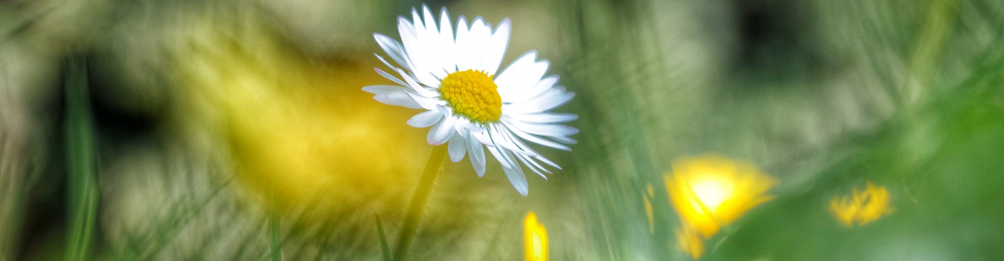
I also spend a lot of time taking photographs and when I looked through my library, found that a large majority focused on nature, flowers, animals etc..

Draw and select

I decided that I was going to spend a lot of time on this assignment to give the best of my ability.  I do like drawing with colour pencils and feel quite happy with this medium so I started with a still life drawing of an iris (bought from the florist).  Having sketched the overall shape and shaded areas looking at the real flower I then finished the coloured details from photographs.

This drawing took at least 3 hours to complete and although I am quite happy with the finished result I feel that I made a big mistake in the colour shading.  After lightly drawing the outlines I blocked in colour areas so I could added detailed shading along the way.  This was my mistake as the block colours were already too dark and made it difficult to pull back afterwards.  I used Caran d’ache luminance pencils which are very soft.  I spent a lot of time with the sharpener as I can only seem to get the desired effect with very sharp pencils.  I found the paper saturated quite quickly which was also frustrating.  I will try different paper qualities as I work through this assignment.

My next drawing was of a pepper in graphite pencil.  For this I used an HB pencil throughout.  This was an intense exercise having to look so carefully at the pepper on the table in front of me.  I sketched the overall outline and then an outline for each different zone of tone or texture.  The pressure on the pencil was so light that it hardly made a mark but by doing this I was able to build up tone and keep sufficient light in the drawing.  I really enjoyed doing this drawing although it was a painstakingly slow exercise.

I like detail and smaller drawings which has not been easy throughout this course as so many exercises have required a large format.

Having completed this exercise I then decided to try the same pepper in watercolour.  This is a medium that I adore but am not at all proficient with.  I think I overworked it and flooded areas with too much colour.  I also think I started with the colours too pale and then struggled to add shadows in a coherent way.  I really need to work more in this medium and practice layering colours.  It was fun to do but also frustrating as I messed up quite a bit.

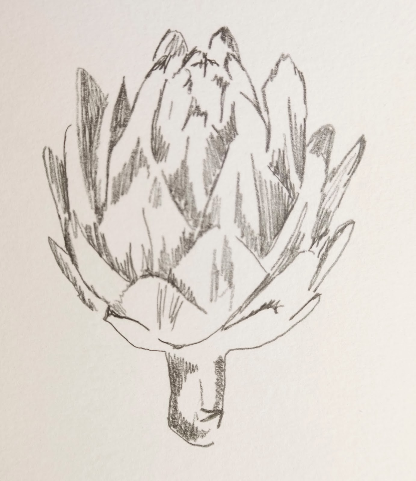
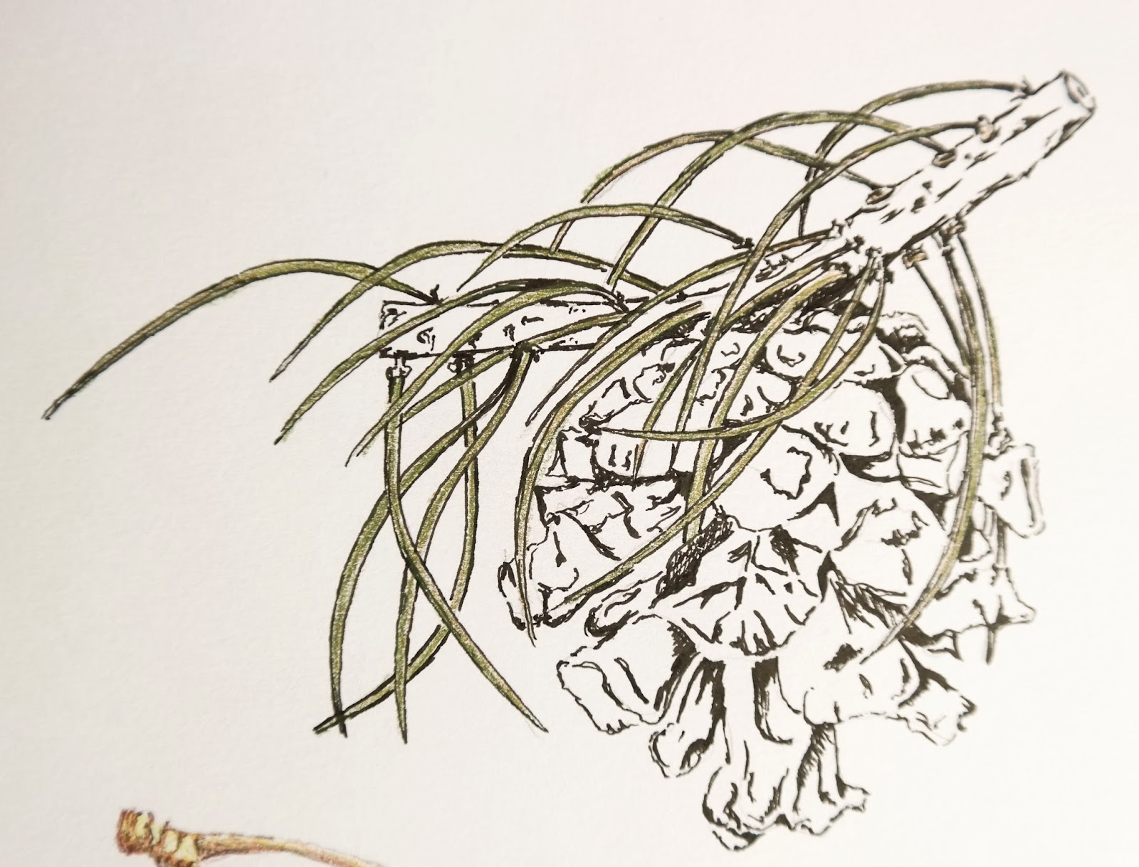
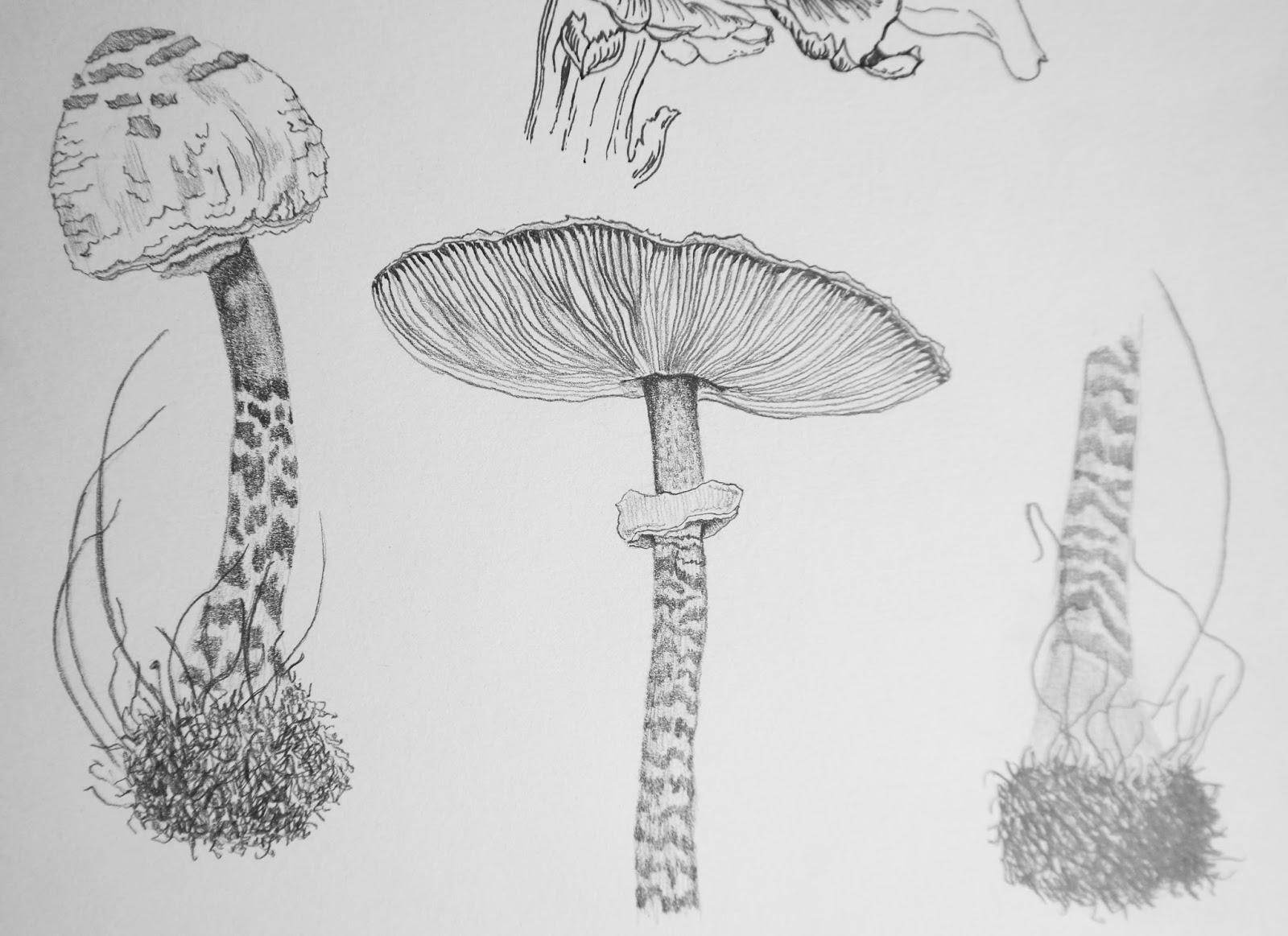
I then moved on to other objects some of which I worked from photos.  The cherries and mushrooms were from photos; the pine cone one of hundreds from the garden and the artichoke a photo.  These sketches were also worked in detail.  I used the Luminance colours for the cherries and a mix of graphite pencils for the mushrooms.

I feel that I have made progress with detailed work and much prefer this to rough sketching.

It was interesting working on different objects with such diverse textures, from the smooth surface of the cherries to the ragged detail of the pine cone.  I really enjoyed the slow building up of colour and shade on the cherries and the detail of the mushrooms more so than the fir cone.

My final studies in this section included various views of apples.  I filled a page using different mediums and view points but quickly decided this would not be my final choice of object.  I liked trying to get the rounded feel and grain of the skin but otherwise it wasn’t such an interesting choice.

All of the above studies were produced indoors with natural light and not a direct lamp light and although the artichoke here is my least favourite drawing I choose it as my object for the final assignment because there is such rich colour and variation in shape and form.

Self portrait

Exercise Drawing your face

I drew these self portraits, one from a photograph and the other using a mirror. The first is from a photo and I think captures the likeness better. The second is from an unfortunately angle and is less flattering. I was leaning back on the sofa when drawing. Faces are the hardest thing to draw but really looking at each feature and the shape and space around it helped to break it down and thus simplify the task. Adding shading or using soft pastels of charcoal would have added another degree of difficulty for me, so rather cowardly I stuck to pencil.

Portrait from memory.

Drawing a portrait from memory is difficult but I tried to remember the rules of proportion and shape.  I don’t think this portrait looks anything like me but at least all the features a roughly in the right place. The mouth is too narrow but that can easily rectified. I should rework one of these sketches to add shading which will give a sense of perspective and depth.

Check and log

Which drawing materials prodded the best results? Why?

Well, I stuck to pencil, so I guess I need to go back and try some other mediums.

Does your self portrait look like you? Show it to a couple of friends or family members and not down their comments.

I think it does. My husband, who is not easily complementary thought I had made a good effort and could recognise me. My daughter giggled a little but said she could see the likeness and remember where the drawing was from, which was encouraging.

Did you find it easy to convert your sketches into a portrait?

I didn’t use my sketches to work on when doing the portraits. I started afresh. The sketches helped to break down the parts of the face and proportions.

Were your preliminary drawings adequate?

They weren’t particularly helpful and were not of a good quality.

The moving figure

Exercise Sitting and waiting

I sketched different people in different poses and tried hard to capture the mood of them as well as draw them correctly. I drew these people from observation except for Adele which was from a photo in a magazine. I used an HB pencil and stuck to mainly line drawings with a little shading. I do not have the confidence to sketch with charcoal as it usually ends up in a grey mess. I do enjoy using colour pencils, as I like the control this gives. Again, these drawings are rather structured and controlled, I need to work on loose sketching with more freedom.


Fleeting moments

I have a few sketches of people in movement or when it was not easy to sit and draw. I found this difficult to organise so this section is another that needs working on. My husband playing golf started as a quick sketch but again I worked on it to make it more presentable. I really don’t like the quality of my quick sketching and will make this a focus for the next and final assignment as well as more detailed work.

Check and log

How well did you manage to create the sense of a fleeting moment rather than a pose?

Not so well, I think it is an art in itself to be able to sketch just a few lines and make it look good. Unfortunately, I don’t have that skill. Even though these sketches were quickly done, I still feel that there is a feeling of pose.

How successful were your attempts to retain an image and draw later?

I struggle to draw realistic things from memory. I prefer to have the image in front of me, whether a real model or photo.

Were you able to keep to a few descriptive lines to suggest the person’s movement or were you tempted to keep introducing more elements into your work?

No! I felt the need to complete the drawings too improve the sketches. I will work on this technique as I think practice will help.

The clothed figure

Exercise Fabric with line and form

For this exercise I draped a cotton cloth over a chair and started by drawing the outlines. I drew in the folds and then in the second sketch tried to shade the fold lines. In the second set of drawings, I reduced these clothes from a washing line to simple line drawings. I had originally drawn them for another project they depicted the form of clothing well.

Form and movement in a clothed figure

In these sketches I tried to capture the pose and also the feeling of form within the clothing. I tried to shade using hatching rather than tone. I like the couple lying on the grass. I guess to improve this section of the course I could do a more detailed and longer drawing of a model. The 2 drawings below were also something I had done for another project but I had spent a lot of time looking at how the clothes fell and the folds.


Check and log

Did you find it easy to approach the figure as a whole or were you distracted by details of the sitter’s dress?

I roughly sketched the outline of the forms for each person and then started sketching in the details. I was always aware of the shape, form and proportions of each person. I tried my best to keep true to the correct proportions.

How did you create volume in the folds of fabric?

I am not sure that I did that well, perhaps it was more successful on the first page of sketches.

Does the finished drawing give a sense of the figure beneath the fabric?

Again, I am not sure the drawings are detailed or finished enough to critique this. I do feel that they are 3 dimensional rather than flat and 2 dimensional and have a feeling of form.

How would you tackle a drawing like this again?

Structure

Exercise Three drawings

I choose to do these 3 drawings in pencil, pen and oil pastels. I tried to look at the proportions and detail. Getting the face right was difficult, it’s easy to make someone very ugly.

I think that perhaps these drawing should have more detail or shading but am happy with the general gesture and form of the model. I also added some drawings from the class which corresponded with this theme. I am happy with these as managed to deal with the foreshortening of the legs in the sitting poses.


Check and log

How accurately did you depict the overall proportions of the figure?

I am happy with the overall proportions. I think there should be more detail and shading in the drawings so maybe reworking them could be a positive thing.

Did you try to imagine the sitter’s skeleton and muscles? Did this help you to convey the figure’s structure and form?

I concentrated more on the lines and shapes that I saw rather than the skeleton. Thinking about the muscles is more useful to me, helping to give the idea of bulk and form.

Gesture

Exercise Stance

I did quite a lot of quick drawings in the class sessions as warm up exercises but they unfortunately got lost before I could take them home. They were really quite rough and not necessarily worth keeping. I find quick, rough sketches incredibly difficult and usually end up with a lot of rubbish. I prefer precise, detailed drawings. The large drawing here is one of the sketches I managed to save.

Exercise Energy

Again, this was a difficult exercise for me. I cannot produce decent quick sketches showing movement. I struggled with this and skipped quickly on to the next section. I will before the end of the course come back to it and try again.

Check and log

How well have you managed to capture the poses? What could be improved?

I struggled to produce sketches of the moving figure and if I did I tended to work on them and continue with pen or watercolour to improve them. I realise that this wasn’t the object of the exercise and need to go back and rework some of this section.

Do you think that your figures balanced? If not where did you go wrong?

In the sketches I did the figures were proportionally correct but failed to convey a sense of movement perhaps?

How did you go about conveying a sense of energy?

Curved, sweeping lines and more fluidity in the drawings.

Form

Exercise Essential shapes

With these two drawings you cannot see the basic shapes too well. I started by drawing the energy flow and main axis of the model and then continued by drawing the curves of the body. I didn’t reduce it to cylinders and boxes but tried to draw what I saw continually modifying to get the right proportions. The second drawing below is again A2 in size which I guess I am beginning to adjust too, although I still much prefer working in a smaller scale. It is also new to me to work on an easel and holding the pencil in a different way. You can see the outlines have been reworked many times. These drawings are more precise than my previous sketches, we were encouraged to work precisely but remain loose at the same time.

Exercise Essential elements

The following drawings were again, part of the life drawing class. This time they were shorter exercises roughly 10-15mins each and using charcoal. This was another challenge altogether. On some of the drawings we were instructed not to use any outlines but to use the charcoal flat and produce shapes and shading. This was difficult at first and created a lot of rejects. This was an interesting way of looking at the model and if you could let yourself go a much freer way of expression. I am sure it needs practice as with all drawing.


Check and log

Were you able to maintain a focus on proportion at the same time as creating a sense of weight and three-dimensional form?

I think I was always aware of shape and form, maybe too much so but if the form was completely wrong I wouldn’t feel able to continue until I had corrected the form. So, on reflection I probably put too much emphasis on form when I should have concentrated more on shading.

Which drawing gives the best sense of the pose and why?

The two drawings I prefer are the girl with the hairband and the girl above her leaning forward on a table (which you can’t see). They seem to flow and have a certain energy and ease. The girl with the hairband has shading which work quite well, although, upon reflection, I should have also put the props so she doesn’t appear to float on nothing.

Was there any movement or gesture away from the model’s central axis? If so did you manage to identify this and put it into your drawing? I am not sure I understand the question.